‘Explored through the vehicle of the traditional school class photograph, this vast new art work is one of the most ambitious portraits of children ever undertaken in the UK. It offers us a glimpse of the capital’s future, a hopeful portrait of a generation to come.’
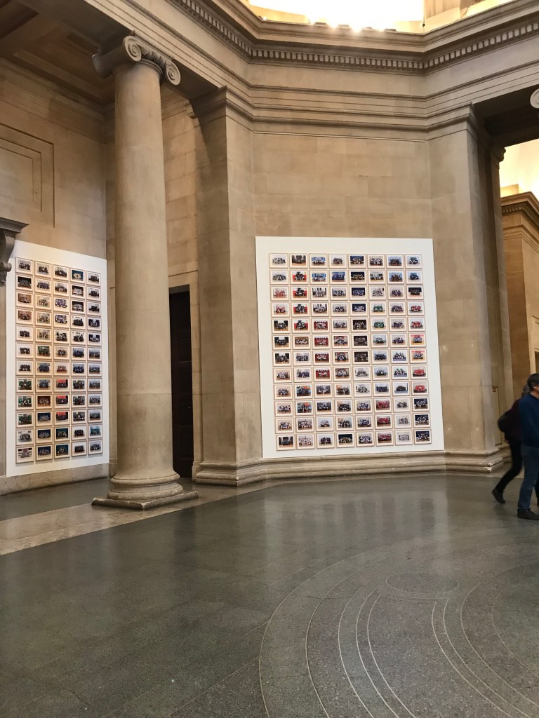
Steve McQueen, prestigious artist and film director moved his lens onto the children of London, more specifically the 7 and 8 year olds that inhabit the Year 3 classrooms. His interest spurs from a psychological stance, that in Year 3 you are in the most developmental and important aspects of childhood with regards to the mind and body. His decision to explore not just one class, but the whole of London led to his photographs containing 76,000 subjects, a huge number that would frighten any curator or gallery space.
Yet the main hall of the Tate Britain accommodates each and every one of the images in an orchestrated and uniform fashion, reflecting the children’s poses within the images.
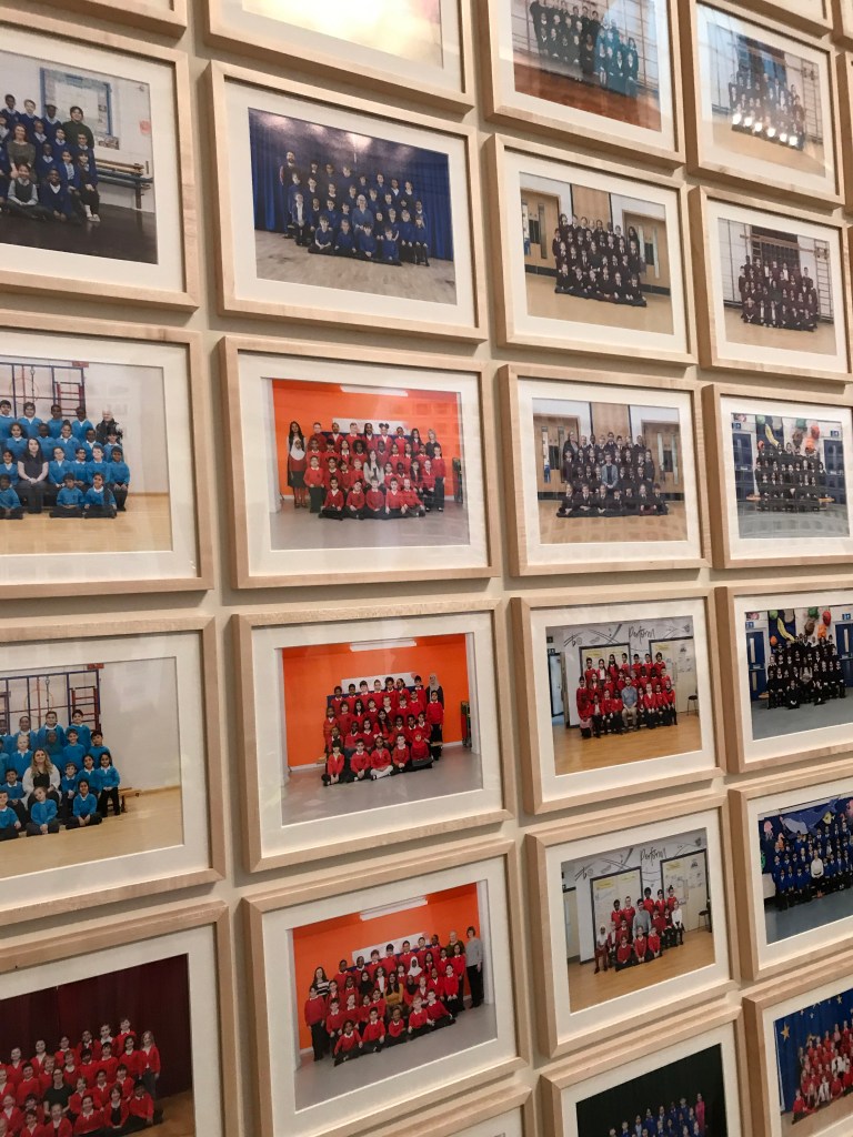
Upon closer inspection the images do allude perfectly to the classical class portrait, albeit the light is perhaps more subtle. The portraits have been taken inside the schools, so each background differs from the other, and McQueen has chosen to mix them all up when hanging, as oppose to sorting them colour and aesthetics-wise. This adds more depth to the project and helps to illustrate the diversity of the new generation of London, with children of all different races, sexes, height, weight etc.
By placing the images together in these 10×10 (approx) formations on the walls viewers are staring up at subjects, giving the children depicted some authority and power, despite the fact they’re normally child height. The overwhelming number of images surrounding the whole hall again adds to this and leaves viewers looking as a whole and not at individuals. He was managed to document an entire generation and illustrated strength in numbers. I feel its important that the images are all uniform as it makes each subject feel equal, as oppose to perhaps blowing up some of the images to a larger scale in the gallery space.
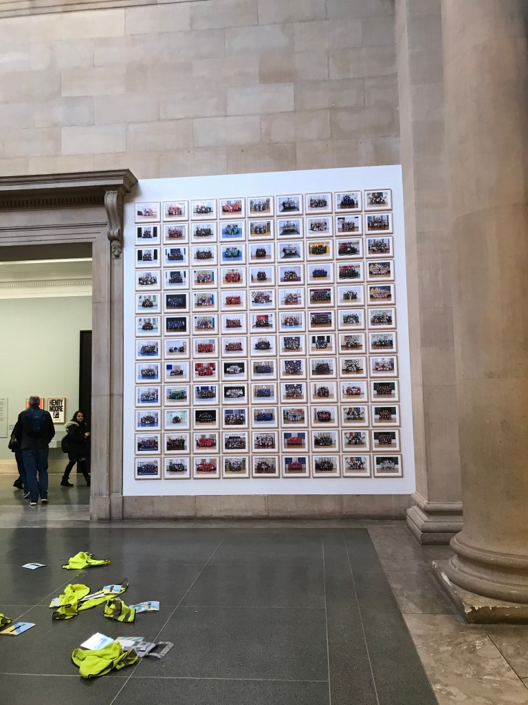
The frames are very simple, made of cheap wood and again are all uniform, adding a normality to the images, despite the fact they are in a space of such grandeur. This feeds into the equal aspect of the work and how the framing and size of a work can subvert the space it’s in.
McQueen’s images are also on billboards around london, although they depict only one class portrait per billboard. I enjoy this variety of print sizes and the opportunity to take a closer look and admire the quality of the print if it can be expanded to that size. I also think this is a great way to share work with people less aquatinted with the art gallery and draws them in or allows them to comment, removing this elite stance on who admires art.
On initial impression I couldn’t imagine how the images would fit in the space, I presumed they would be placed in a more classical gallery area with white walls and studio lighting yet McQueen has changed this perception. If I were ever to display a large amount of the prints I would consider using a space less traditional.
