I have always enjoyed visiting the NPG at the time of the portrait prize as theres the opportunity to discover new photographers and to understand the different lives people live. I also admire the inclusive element of the prize, and that anyone can enter as long as they can provide a portrait.
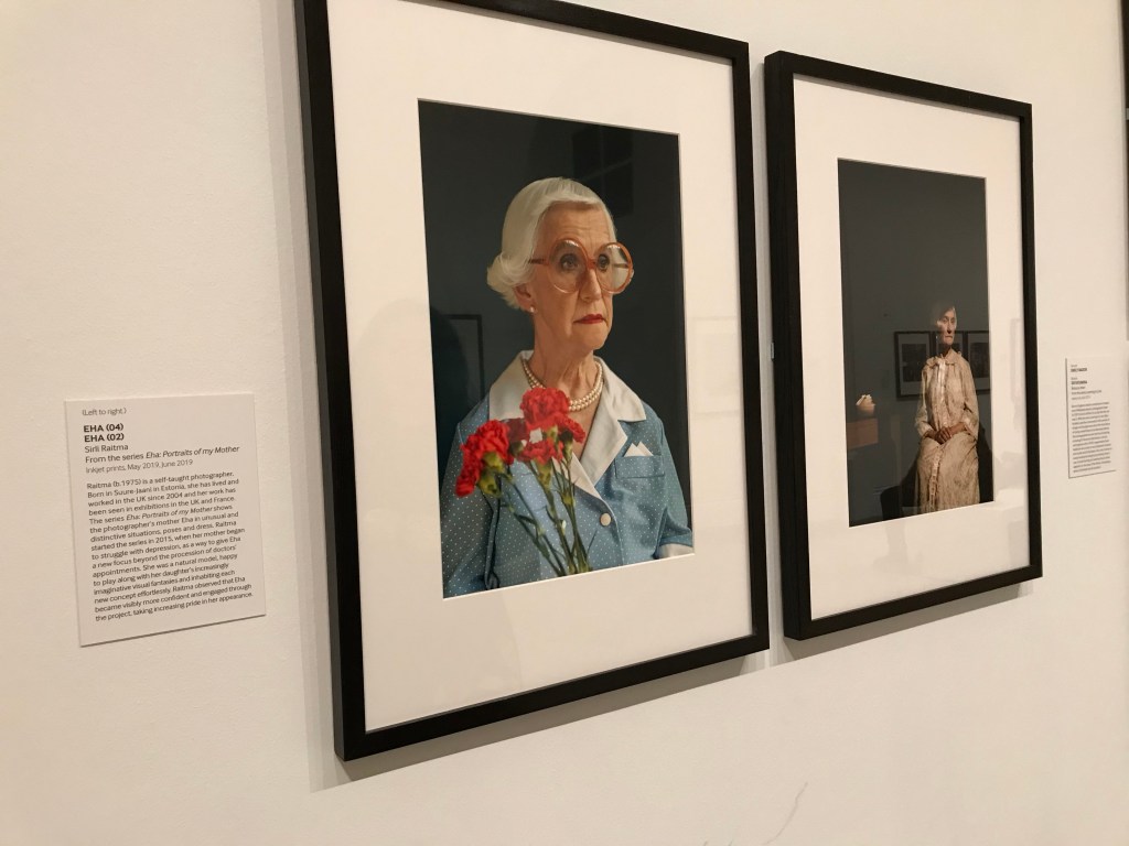
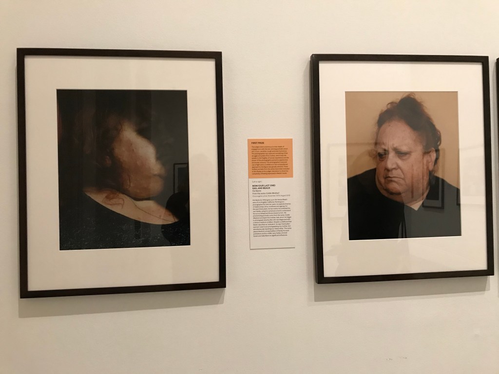
Whilst all the images displayed were vastly different, the curator had opted for the same black frame and mount, to add a uniform order to the collection. Upon first glance I was disappointed, as I felt some of the images would’ve suited a different coloured frame, or an antique guilded frame. I soon came to understand that as it’s a competition the framing has to be the same on each image, so that they can be judged equally. I found this to be fair as it fits again with the inclusive manner of the prize, and that if images were to be framed by the submitter, the perhaps some would have looked beautiful in expensive frames while others may have lacked or lost due to their lack of.
I was impressed with the framing and mounting, as I feel this is something that I haven’t explores yet in my work as there hasn’t been a need to, or if I were displaying work I would simply nail the print into the wall. The mount gave the images more value and also some negative space so that they could be admired to the full extent, they feel separated from the wall and frame. This worked especially well for some of the more thoughtful pieces, that looked at difficult subjects of death, loss and change. The mount felt like breathing space for the viewer and the subject.
I also really appreciated the statement alongside each image, as unlike Steve McQueen’s images, that were all his and depicted the same thing, statements felt necessary in the Taylor Wessing so viewers could have a little context and take note of the artist for further research. Its given me an insight into how important statements are for people understanding your work and also making contacts and a bigger name for yourself.
With regards to display in the exhibition, the images were all rather uniform in their spacing, they each had an equal space on the wall and were hung at the same height with the same space in between. This again feels important in a competition to share the space equally and to give viewers no bias.
Overall I enjoyed the curation of the exhibition as it was interesting to think about how a competition must be displayed differently to a normal exhibition, to allow for equal judgement. However I do prefer prints to be displayed at different heights and sizes on the walls as it gives the viewers some variety. Again though, this all depends on the work being shown.
