Positive Aspects:
- Side bar is left hand side leaving plenty of room for the imagery on the right hand size and centre of the site
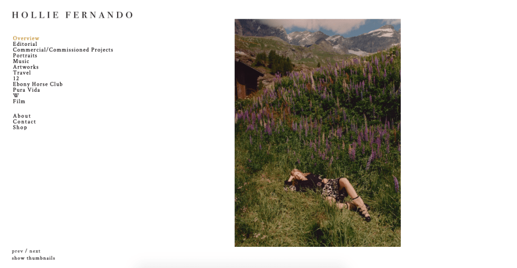
- Immediately greeted with images when you load the website, and have the choice to flick through this overview of imagery which is all fairly different in subject but can see Fernando’s style coming through. Also able to flick through with keyboard keys
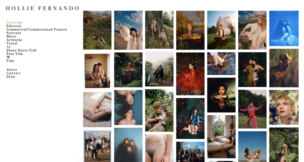
- There is an option to view thumbnails so viewers are able to see all the images on the front page together and select one to look at more closely, works s a mini portfolio
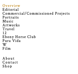
- Projects are clearly ordered and there is space between the projects and information so viewers have a clear understanding of where they need to go
Negative Aspects:
- Could perhaps add the ability to click on an image on the front page and be taken to that project or have the names beneath as viewers are not given this information
Overall: this was my favourite of the websites I explored as it displayed a portfolio of the best images but in a subtle, simple way that any viewer can understand and engage with. I would like to try and replicate this layout on my own website but perhaps have project names so that viewers can get to know the projects better.
