Positive aspects of the website:
- Gridded background adds a more WIP, sketchbook feel to the website, images feel as though they are stuck or taped onto the page so more relatable and down to earth for viewers
- Enjoy the simplicity of the site, lots of space and font is clear and easy to read
- Left hand side bar is easy to navigate with not too much information, viewers have a clear and concise menu to explore
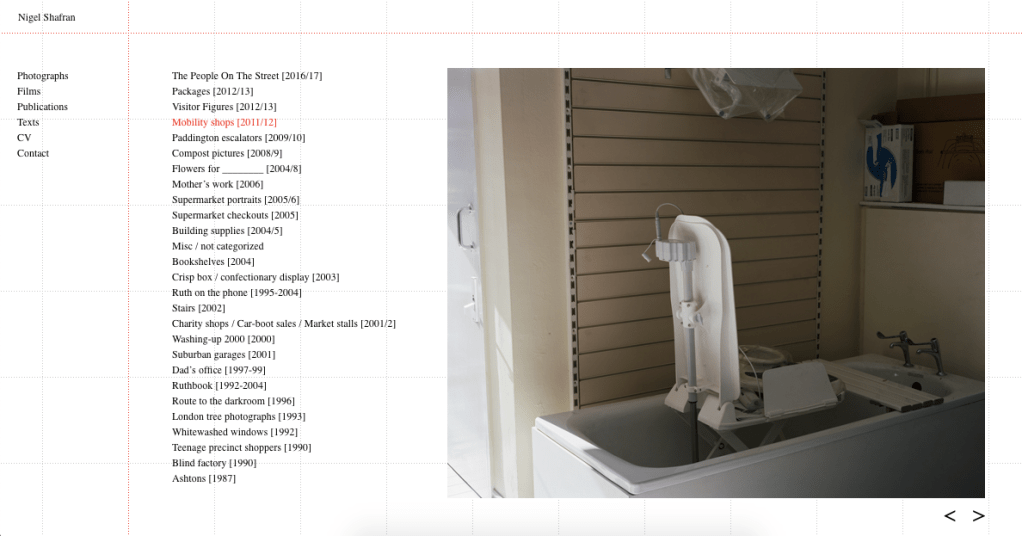
- Space is filled with an image when a project is selected, viewers can see the images on a large scale and click through them
Negative Aspects:
- Lots of negative space on the website before you select a project, feels like the menu could be centred
- Imagery is not evident until you click on a project, so perhaps lesser known photographers would not do well without more clear imagery displaying their work
- Have to click on the left and right arrows on the screen to go through images, would be good if could use the arrow keys on the keyboard
- His name is on the left hand side of the screen throughout the whole website, perhaps could be centred to illustrate importance of it being his work on display
Overall:
I really enjoy the simplicity of the website and the colour scheme that kenos itself to a sketchbook. I will look at having another background colour as oppose to white as my work is very much about WIP and messing around, and i feel the white background can sometimes appear too polished. I also appreciate the simple sidebar menu and the neatness of each page so that viewers can find their way around the side efficiently. I hope that mine takes some of the aesthetics from Shafran’s but I will need to display more imagery on the first page, so viewers have a portfolio before them straightaway and therefore something to intrigue and interest them.
