http://www.sophiegreenphotography.com
Positive Aspects:
- Domain has ‘photography’ in its title, easy to decipher from other names that this is the photographer
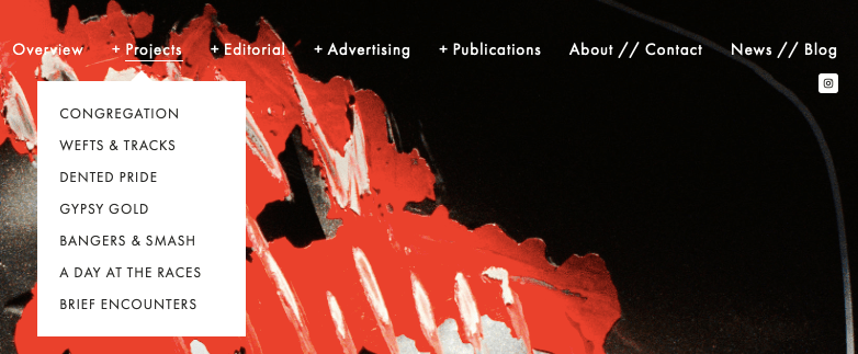
- Drop down menu of each category is very simple and easy to use, also very well organised so clients can easily navigate to whichever kind of work they require
Negative Aspects:
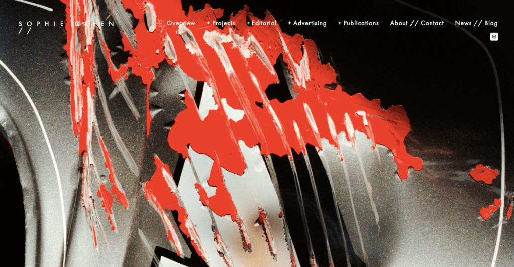
- Site begins with a ver bold image that makes the text harder to read
- The initial image is also very different from her photographic work so would leave viewers perhaps confused whether they were in the right place
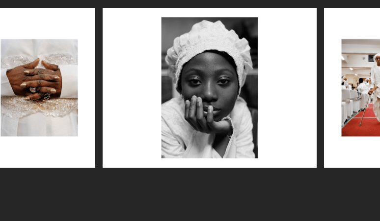
- Overview page is more akin to a front page, looks like a professional polished portfolio, however I don’t like the white bordered images on the nalco background, feels as though its taking away form the imagery.
Overall: I would personally prefer a more simple website or front page, that displays the kind of work I do and has a more subtle background that doesn’t take away from the imagery. I do enjoy the drop down menu at the top however you have to scroll back up to change pages.
