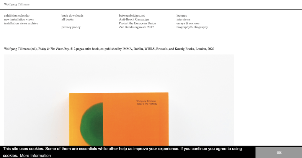
Positive Aspects:
- Domain is clear and concise, viewers are aware whose website they are visiting juts by the name, but would this be the case with a lesser known photographer?
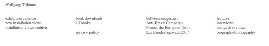
- Website is very similar to the layout of a blog, with headers at the top followed by the newest posts running below. This keeps the page nice and conversational as well as keeping viewers updated with the latest doings of the artist.
- White background works as there’s a variation of different imagery and text on the page, all different colours so white is the best choice
- Name is in the left hand corner and is in a simple font that anyone can read
Negative Aspects:
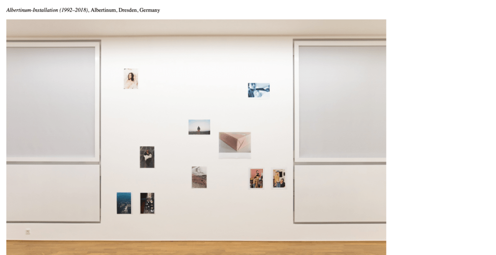
- Not great as a photography website as images are not clearly displayed but is easy to navigate and explore
Overall: The website is very informative and is regularly updated, keeping viewers up to date with what Tillman’s is creating. It also illustrates his interests and other projects he involved in as a multi media artist. However, I don’t have as much content to update so regularly and feel this would be better suited to an instagram layout if it were my work. I would like a website with more pages as oppose to one page which can be scrolled through containing all Tillmans work and current projects.
