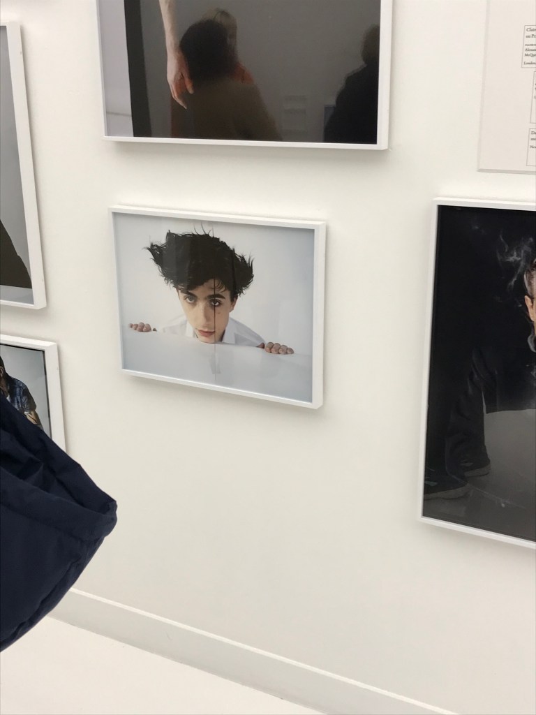
I have always admired the work of Tim Walker so felt enthralled to be able to finally see his work in a solo exhibition space. the galleries route split his work into all its differing genres and projects, and the spaces themselves fully encapsulated this. The initial room was white and rather plain, with his portraits taken in a more commercial sense and fashion imagery displayed on all the walls. This felt perfect for the photographs themselves as there were acute details and colours that need viewers to lean closer and focus on, so the interior didn’t take away from this. Each image was framed in a white wooden frame and hung in a less linear oder, appearing more like a sketchbook than simply placing images side by side on the wall. I really appreciate this approach to hanging as it makes the most of the space and feels less formal, it requires viewers to work on different levels to view what’s in front of them. It’s something I would definitely consider for my own work as I appreciate the less formal perspective.
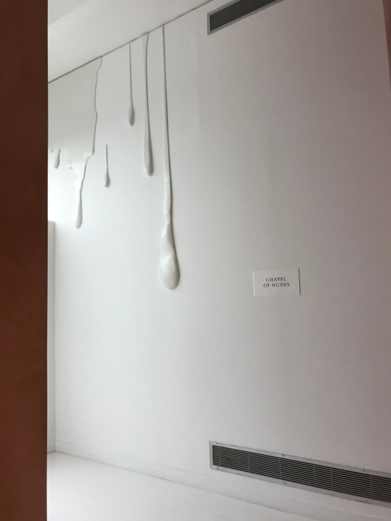
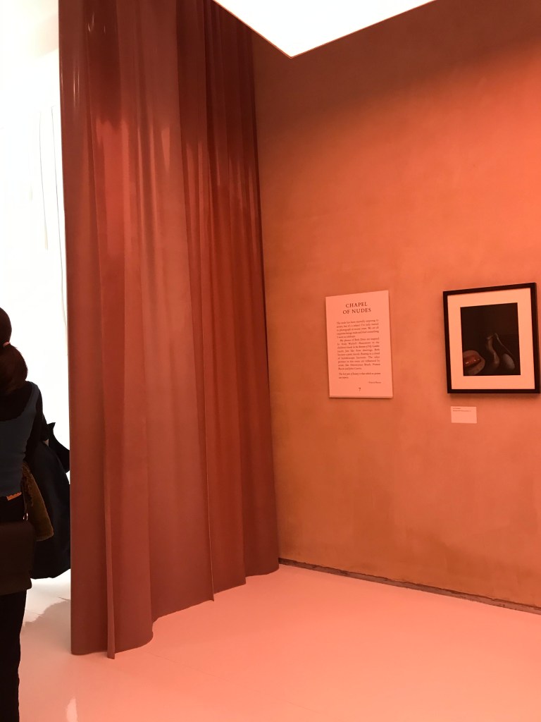
The room leading on from this was concealed by a latex curtain, which visitors had to push through in order to enter. This already sets a feel for the images inside, which are named the ‘Chapel of Nudes’. The stark movement from the bright white open space into a smaller pink room with walls covered in pink velvet create a sexual and seductive scene in which the images feel perfectly in place. The images within the room were far smaller than the portraits and meant viewers had to get close to view them, adding a more intimate and personal approach to the collection. I enjoy the cleverness of making the space just as important as the images on the walls and think this could be echoed in my work and perhaps in everyones. The photographs had black frames and a large white mount, making them stand out from the wall but also making the image size even smaller. The attention to detail and thoughtfulness with combining the imagery and space is wonderful and important in an exhibition space, something I will consider in the future.
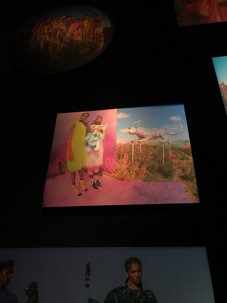
Whilst there were many other rooms the next was the one I found to be most intriguing with regards to curation and framing. It focused on his more adventurous fashion work, for Vogue and other high end fashion magazines. the images were taken during the heatwave in the UK a few years ago, so there was a huge expanse of colour and light which exploded into the space. The room was very dark, and only lit by the spotlights on the images, making them appear as though they were placed on light boxes. The images were placed at varying heights, far taller than the viewers beneath. Above these were the props used in the shoots, dreamlike neon animals and flowers, adding to the dreamlike scene. The photographs themselves seemed to be placed on thick mount board, so it was less about the quality of the print and more about the scale and overall appearance of the room. Although I’m not sure I would create work on this scale, I enjoyed the use of props to remind people of the process of being a photographer and the work that takes place behind the scenes. I also think the use of spotlights in a dark space really brought out the colours and the movement from the room before added to this change in atmosphere.
Of all three rooms I’ve focused on I feel my work would most suit the portrait room or the nude room, just because of the more formal choice of framing but i also appreciate and can see the need to create an atmosphere in the space, whether this be by changing the wall or floor coverings, or applying a curtains or certain light. I don’t want to be simply complying to the traditional.
