https://www.olimpiapiccolo.com
Positive Aspects:
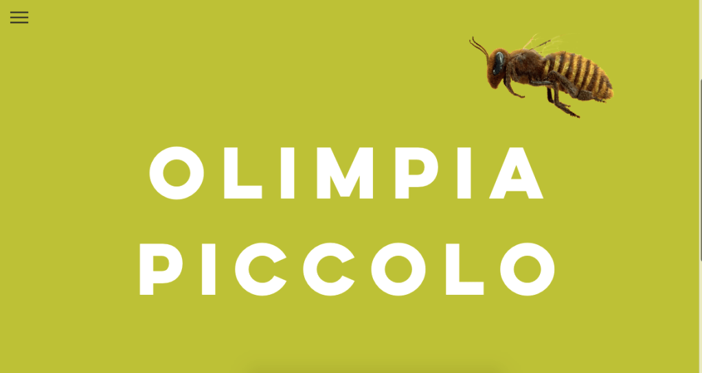
- I enjoy the front homepage, feels bright and automatically gives a sense of personality. The font is also very clear and a good choice
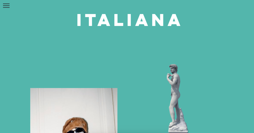
- Project pages are all very different from one another, can decipher each one. They begin with a coloured background with a bold title then scroll for imagery. The images are placed sporadically on the page, making for more of a sketchbook feel, which I personally really enjoy, it feels far less formal and differed from many other websites.
Negative:
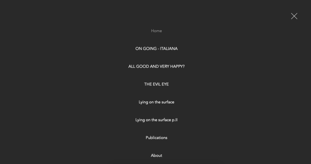
- The homepage would be good if you could click to enter the site, as it feels pointless to have the page there after you have visited once, there’s no options or buttons on the page, only on the drop down menu.
- The bee that flies in and rests on the font feels strange and out of place, I was unsure how this connected to the work and why it was there
- The home page is also only fully visible if you scroll down, otherwise the artists name is not clear, would be good if this was centred.
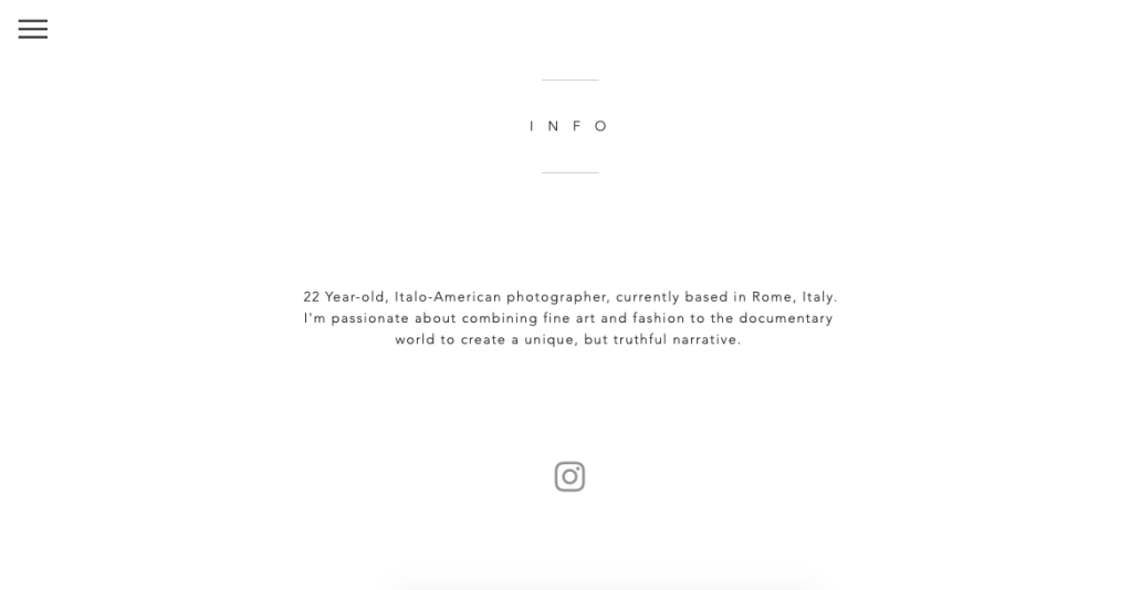
- The about page is very dull and corporate in comparison to the bright colours that are visible in the rest o the website.
- I like the three lines that are a button for the drop down menu as they are not distracting but the drop down menu being central is not something I’m too keen on.
Overall this is a website I really enjoyed scrolling through and I have taken some inspiration from. I love the personality that shines through, evident in the colour and font choices. The placement of imagery in a less formal way is something I would like to replicate with my work. I think it just needs to be evident throughout the website as the menu and about page lack this and feel disconnected in comparison.
