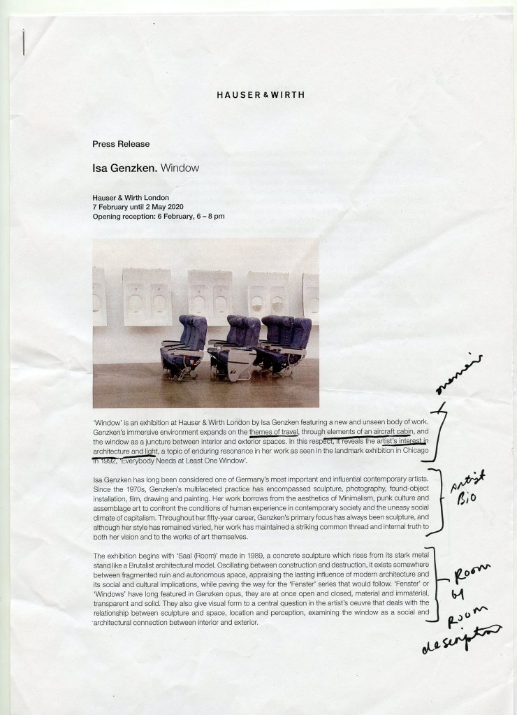
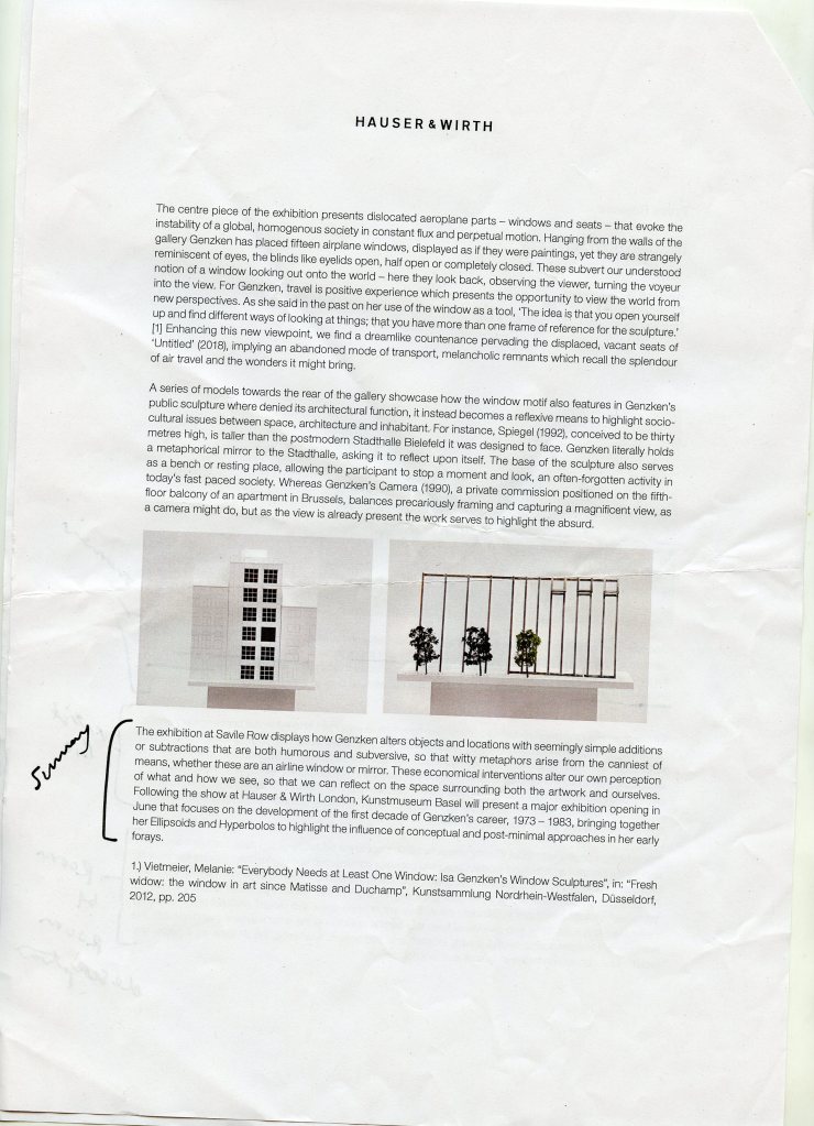
Upon attending the gallery I was given an A4 sheet stapled containing information on the artwork I was viewing. The press release is simplistic in its layout, and reads like a word document as oppose to something more creative. However, this perhaps works well with the work as it feel very quiet and speaks for itself due to its size. The paper style is slightly off white and less glossy than printer paper, which allows it to differ from a bog standard A4 sheet. The first page begins with a general overview of the piece, introducing themes and interests, so readers have a small background to the work. This then leads onto an artist biography and some of the previous work that’s been created, then finally a few paragraphs discussing each piece in greater depth, alongside imagery. The back page was a CV and more formal biography, as well as contact and information on the gallery itself. This page didn’t interest me greatly but is definitely a good thing to include for potential buyers or others interested in setting up shows. I enjoyed being able to wander round and read, as sometimes when there’s information printed on a wall people gather and its hard to read. However, I did think it was a lot of information to take in at the time, so I ended up scanning the sheet and then taking a closer read when I got home. Going to a gallery and being able to take something away is really great, and makes you feel like a greater part of it as you hold your souvenir.
Although I may not be interested in doing such a plain and formal press release, I enjoy the idea of being able to take something away and mull over this, so this exhibition has illustrated the importance of that to me. This has also helped me decide how I would like to promote my work with regards to business cards, which I would instead be more interested in a postcard format.
