Positive Aspects:
- Logo is simplistic and clear, stays in the corner throughout the website and is also a home button
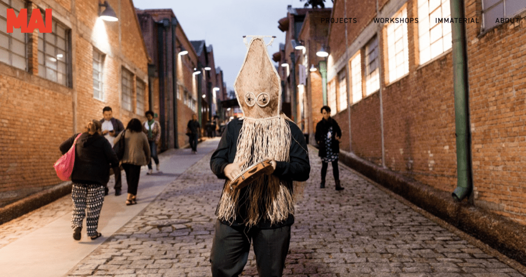
- Homepage begins with slideshow of imagery (as shown above) of a few of the many works Abramovic has created, old and new. Evidence of workshops as well as more personal work, shows a journey through the art world
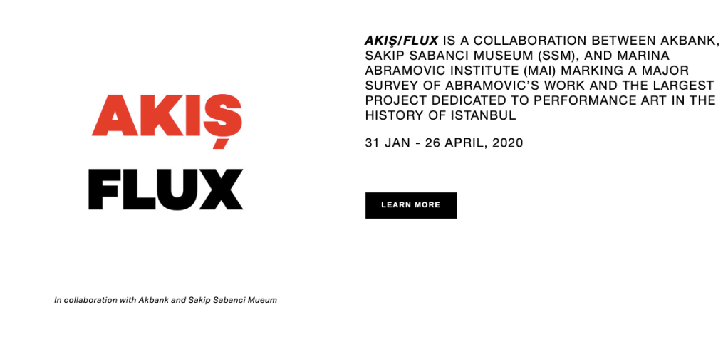
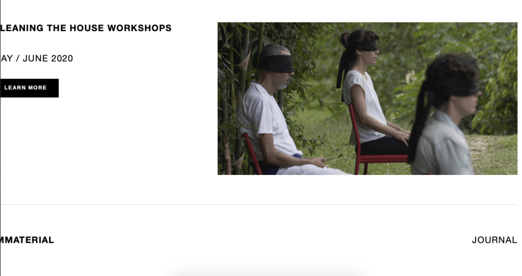
- Scroll down directly from the slideshow and there are dates and links to events currently happening to be a part of.
- Well organised with regards to projects and navigation, there is even a search bar to look through her archives
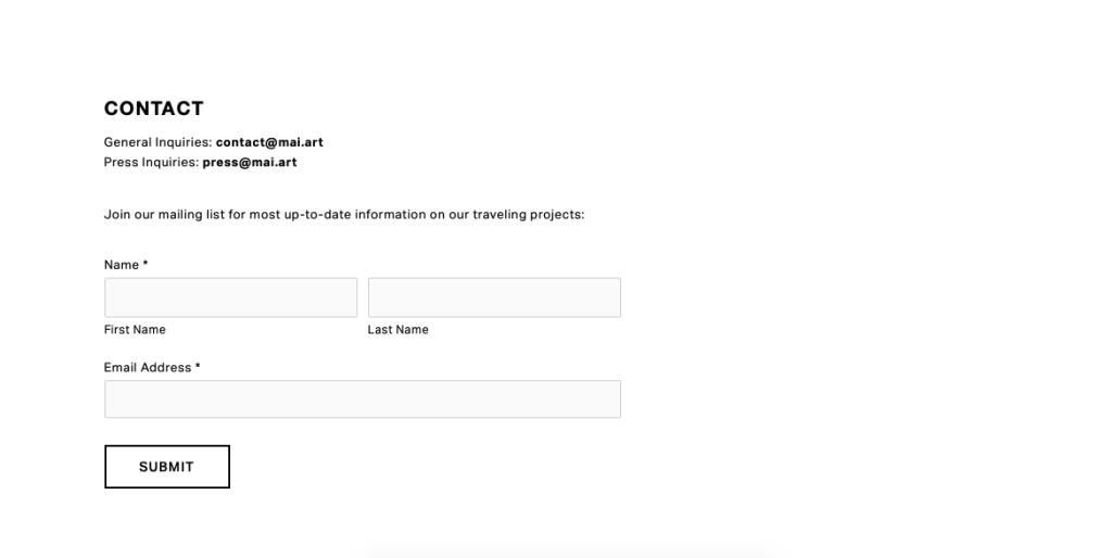
- Contact page is simple and clear
Negative Aspects:
- The drop down menu isn’t always clear or visible depending on what image is on the slideshow
- The scroll down sometimes veers to the left or right, meaning some of the words become unreadable or off the screen
Overall I think the website is clear and successful in informing people of Marina’s work and the current events they can get involved in. It’s different to the previous websites I’ve explored as this is more of an institute, so its perhaps more formal and looks more at encouraging people to get involved as oppose to simply sharing work. However, I really enjoy the initial slideshow so viewers can take in what kind of work is being produced, and I think the logo is great to have as a homepage and is so clear. I want my website to be slightly less formal, as I’ve discussed but this has been a great layout to see how larger names in the art world choose to present their work and practice.
