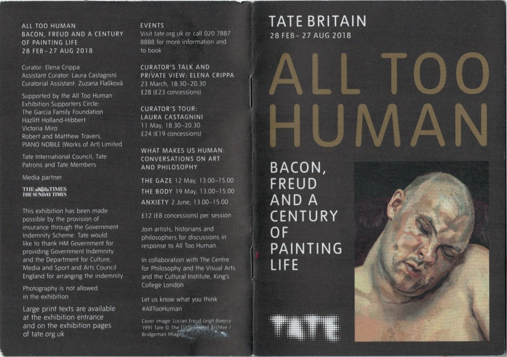
As always with the Tate, they follow a similar style with all their press releases and catalogs, evident in this example. I enjoy the A5 booklet style, it’s simple and a good size for people to place in their pockets and take away. The black paper choice also differs from simplistic white printer paper, making it stand out and again adding to the value of it as an item to take away. The texture is also thick and gives a textured feel to the images, which is unusual and different.
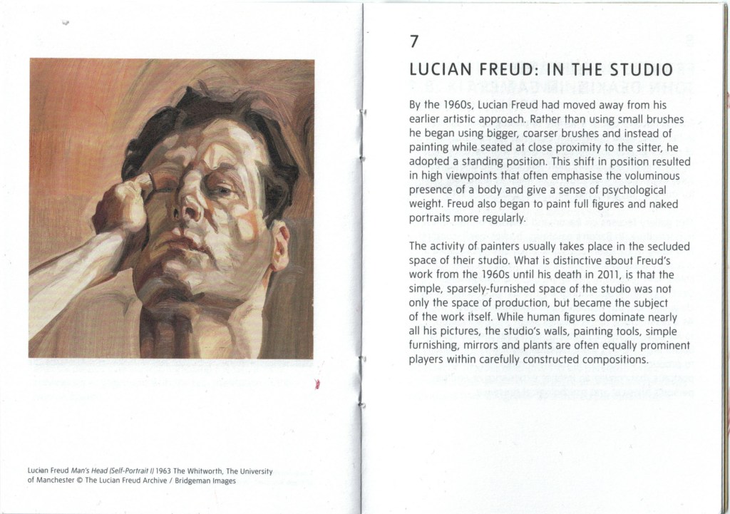
The wording is the same as within the exhibition, allowing those visiting to easily flick through to the numbered room they are in and read from the booklet, as oppose to the wall. I think this is a more accessible way of providing information as it allows people to move at their own pace through the artwork.
It’s well written and provides information about the piece in before you as well as contextualising it into the exhibition theme. I am still referring back to this guide for information on Freud’s practice instead of looking online, illustrating how useful it is.
The back of the catalog provides events and dates about the show, giving people something to explore further, should they want to. This is a useful tool to bring people back to the space and to get them talking.
Overall, I really enjoy this as a catalog for an exhibition as it feels like something more valuable and worth taking home. The choice of paper colour and type adds to this value and makes it stand out. Inside its very clearly ordered and written, pricing valuable context and info on the artists as well as time to think and assess for ones self.
