This is the press release from Prodger’s winning submission to the Turner Prize which was a video shot on iPhone, exploring themes of nature and identity. The press release was stationed just outside the dark screening room, so it was essential it was read before entering in order to gain some context. It was printed on what felt like newsprint, so very thin and already had an informative feel about it, with its correlation to newspapers. It folds out to an A3 size, with information on every side, the front with its cover and context, whilst the back is a transcript of the film itself. This works well within the space as viewers can read the brief description, then refer back to the transcript after viewing the piece.
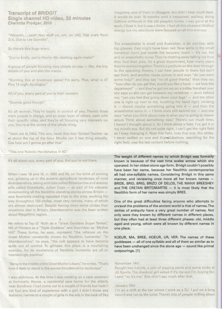
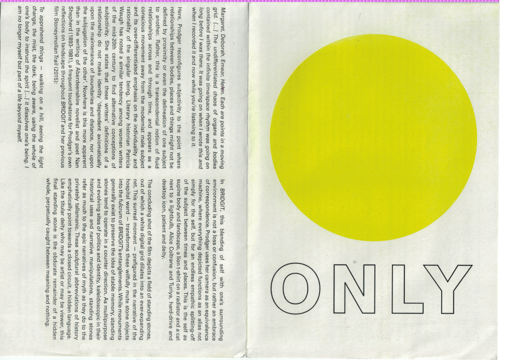
The colourful cover is intriguing, with only an ambitious title and the bright yellow circle. It invites the viewer to continue looking through and question what the title and image refer to. If you turn to the reverse side of the catalog, the transcript has been printed in two different inks, the viewer has to tilt the page to read the bronze writing. I think it has been printed on the Risograph, inferring an appreciation of traditional print techniques from the artist, which I love and think is a wonderful way to bring a sense of history into the contemporary.
Overall I really enjoy this simple catalog and the choice of folding, rather than stapling. Viewers are then able to stick the piece up as a poster. The printing method also adds a value and care unlike other pieces, as the risograph is time consuming and hard to access. I think the choice to include the transcript is also useful as a reference back to the piece and makes it worth keeping.
