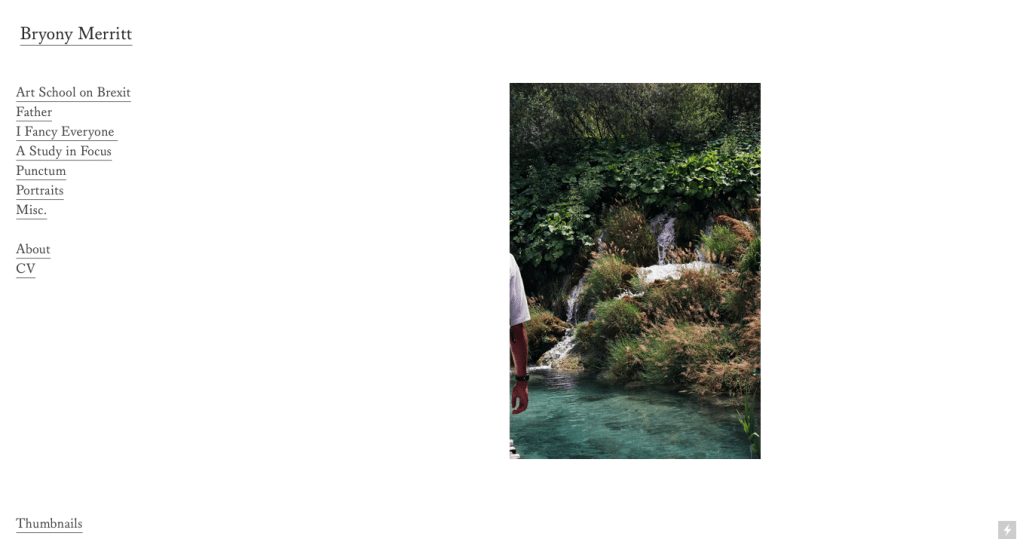
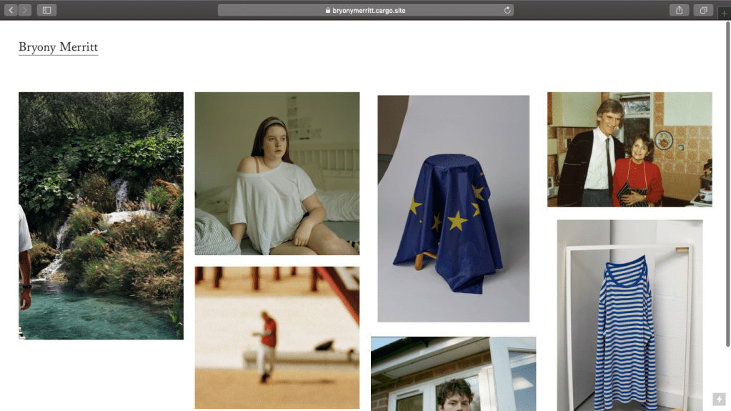
This is my website at the moment. I have taken a more minimalist approach as I felt my images needed space around them and I’m not too keen on copying the instagram grid layout, although it works for some people. An image from each of my projects is on a slow slideshow, allowing viewers to watch and then click on one they would like to view. They can also visit the projects using the side menu. There is an option at the bottom of the page that allows viewers to see all he images in the slideshow at once, by clicking ‘Thumbnail’ which then feeds into the instagram presentation slightly more. This essentially give the viewer more choice over how they want to view the work.
Over the next few weeks I want to make further changes, as it definitely isn’t where I’d like it to be yet. I am going to make the homepage slideshow images larger, so they are more prominent on the page. I also want to spend some time writing in more depth about my work for the project pages, so viewers have enough context and understanding of the series. I will also purchase a domain such as bryonymerritt.com, as we have been told by many visiting photographers that its professional and far easier for people to access your work by having simply your name as your url. I’m feeling positive about proceeding and am really happy with how its going so far.
