I am really happy with my website and the changes I have made. I am also glad I chose a platform that was quite hard to learn but has taught me a lot about website creating and user accessibility. My website leaves viewers space to observe and divulge in my images, i want them to be able to think and reflect and hopefully this is obvious through the spacing.
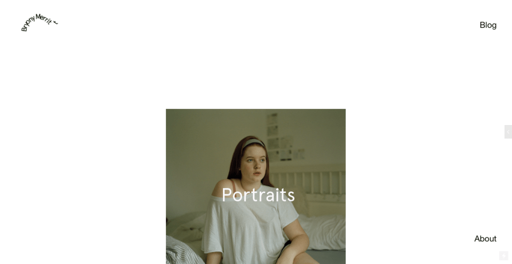
If we look at my website in January you can see there is still an emphasis on negative space and having a slideshow, which I have stuck to. However, I was advised that my spinning logo was distracting in the corner, so have changed this. I did try using a handwritten header but it was unreadable and distracting still so I opted for simple text but in a slighter larger size. I wasn’t a fan of my menu before, and that you had to move along the slideshow to access any projects. The about and blog menu being to the right hand side also seemed odd.
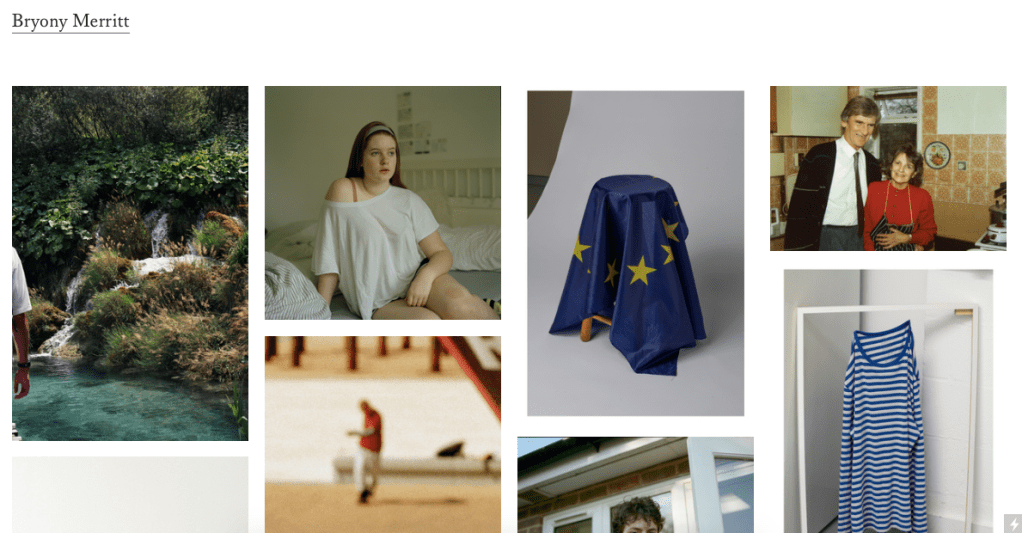
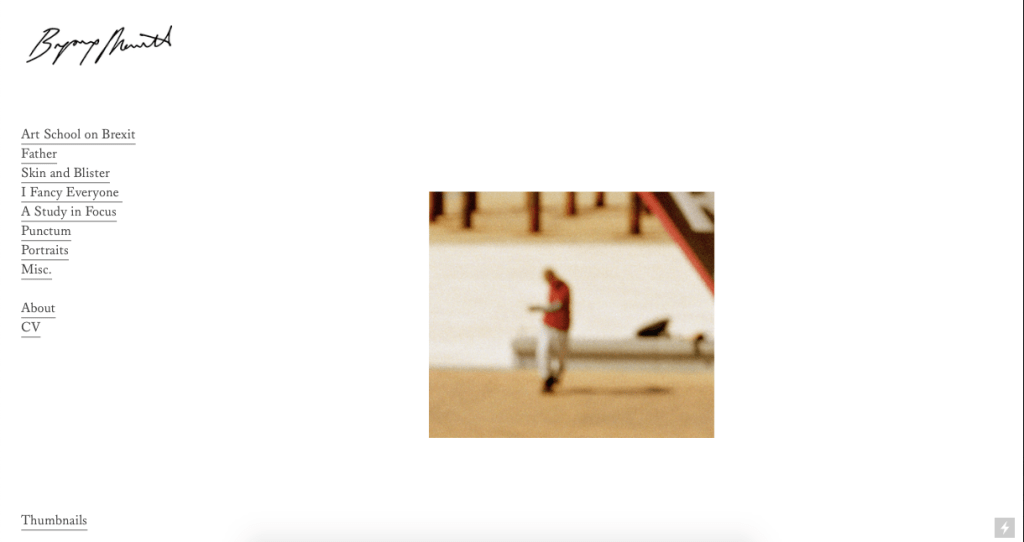
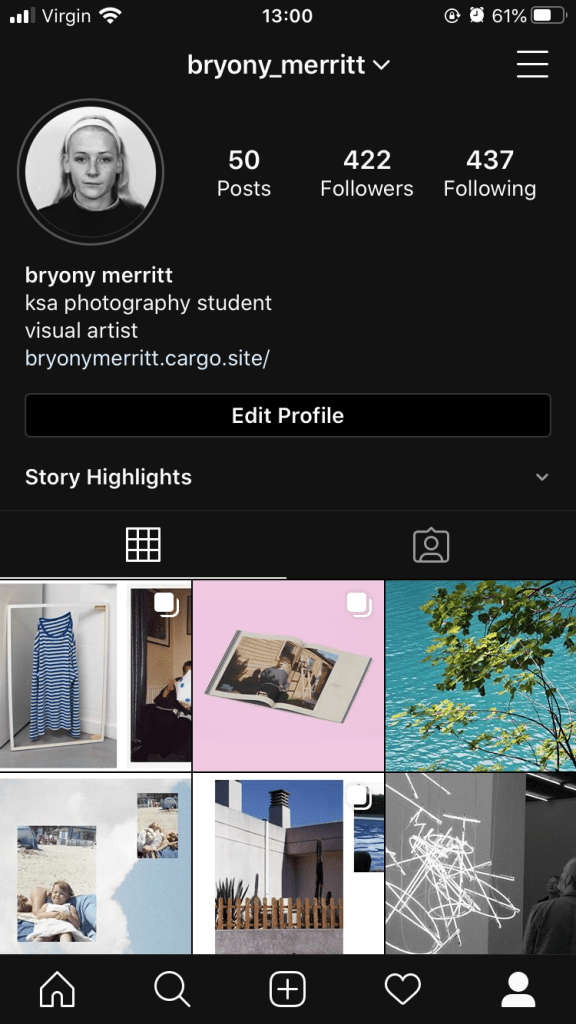
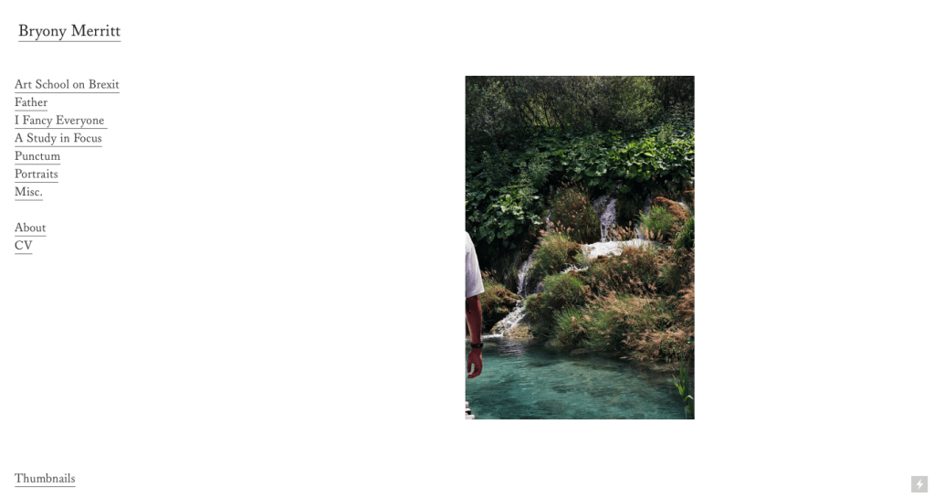
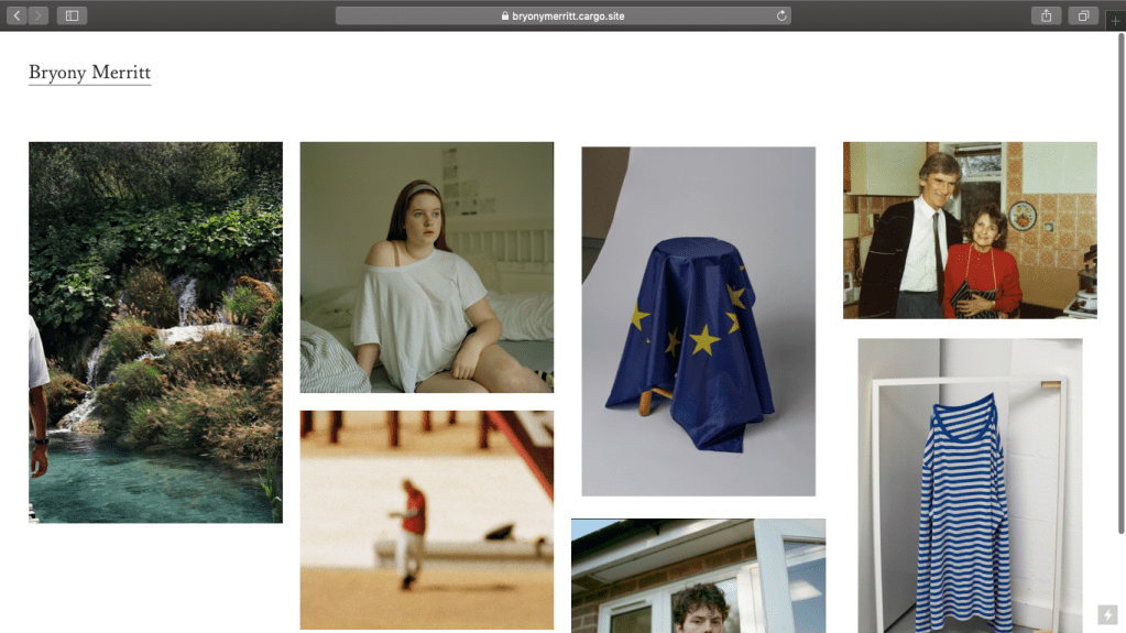
This is how it looks now. I opted for a left hand menu which appears on the homepage and can be accessed again by clicking on ‘Bryony Merritt’. I like the serif font as its formal but also meaningful, which relates to me work. I have also added a thumbnail link at the bottom which allows a viewer to observe all the images of the slideshow and be taken straight to each page. I didn’t layout my main homepage like this as I didn’t want to emulate instagram and that layout, or tumblr and the blog i had as a teenager. I wanted it to be clean and concise. I have put a lot of effort into making my website easy to access and navigate, hence why there’s a slideshow with links to access the work as well as the left hand menu. I enjoy the space between images and when you go onto the website this is filled as the slideshow moves.
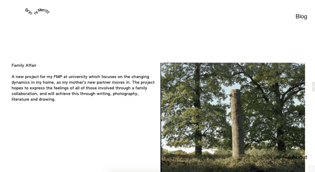
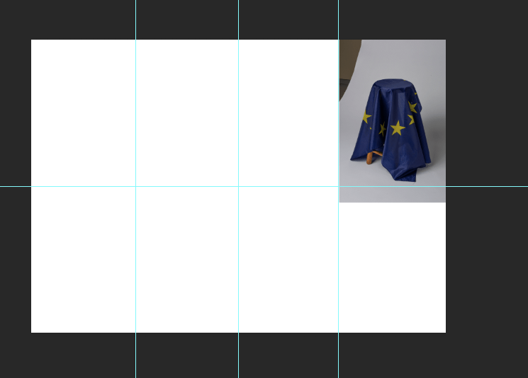
This was an example of one of my project pages before, which split the page evenly between text and image. I feel this isn’t that great as the image is the main part of the page. I also opted for a more formal font so it doesn’t take away from the images.
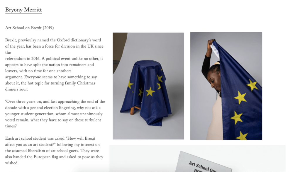
As you can see I have reduced the column size, so the images take more of the space up. I like the pairing of images alongside mock ups of books etc that I have created. Overall I think the pages are a lot more full and interesting for readers, theres far more to look at and explore.
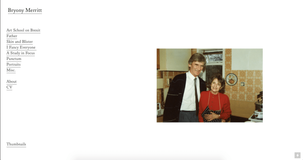
About Page
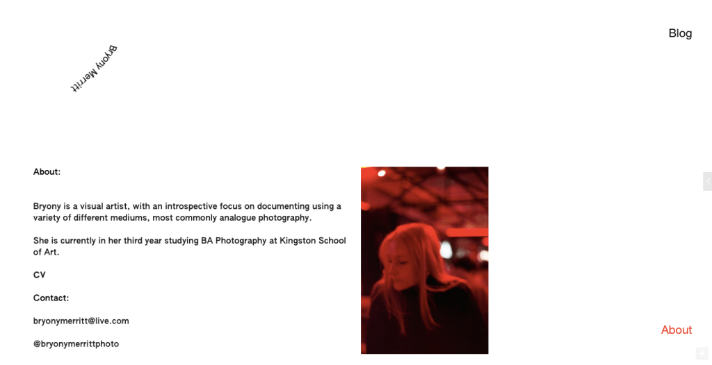
This was my previous information page, which felt fine and was easy to access and understand. However, the statement didn’t really say anything about me as a photographer and the image was a little strange as it isn’t shot in a way that relates to my work or I feel reflects me.
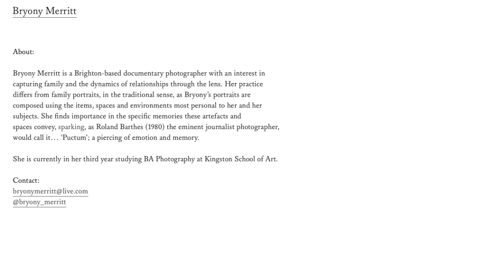
This is my new page. It’s a lot more simple and gives more information. Users are also able to click on my email to begin writing one and can access my instagram by clicking on it.
I would maybe like to get an image at some point but I think my work itself should illustrate me as a person and not what I look like.
Overall, I’m really happy with what I’ve achieved with my website. I never thought I would be able to create one on my own. The process has also taught me a lot about writing on my own work and being concise and clear. Many people won’t spend long on a website so I put my main and favourite projects at the top of the side bar so they are visited first. The slideshow also allows a preview of all the work available. After a talk with Alexander Mourant and his emphasis on buying domain I decided to find one. I went for Bryonymerritt.com as it establishes me as an artist and its a simple url to remember and access.