Instagram Takeover Research

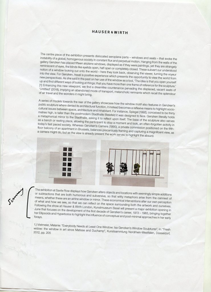
What is an Instagram Takeover?

An instagram takeover is getting someone else to take over your account for a designated amount of time (can be an hour, a day or week) and allowing them to create posts, stories and respond to followers. This is most commonly done by big brands, who use influencers to promote a product. However for this research its more concerned with bigger photography studios and galleries encouraging artists to takeover to share their work with a wider audience.

What can it do?

  • Grow a larger audience
  • Promote new work
  • Add an excitement and novelty to content
  • Promote any shows, private views or competitions.

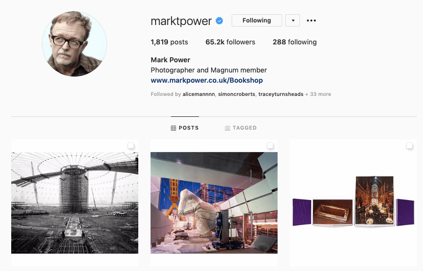
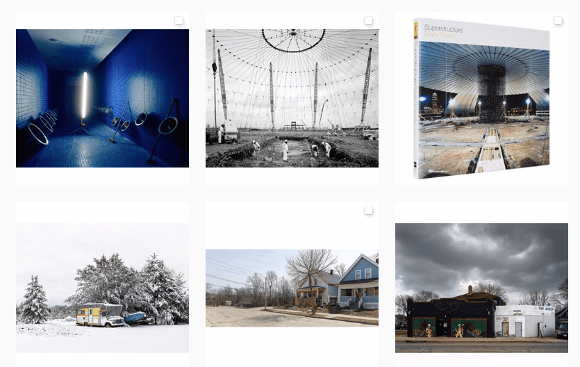
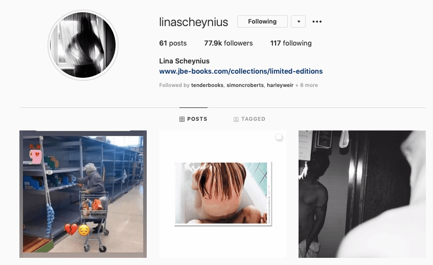
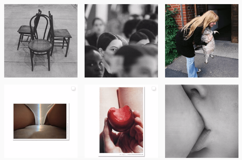
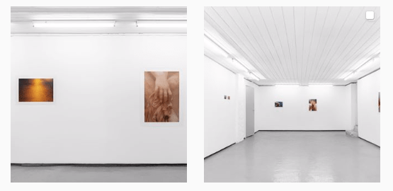
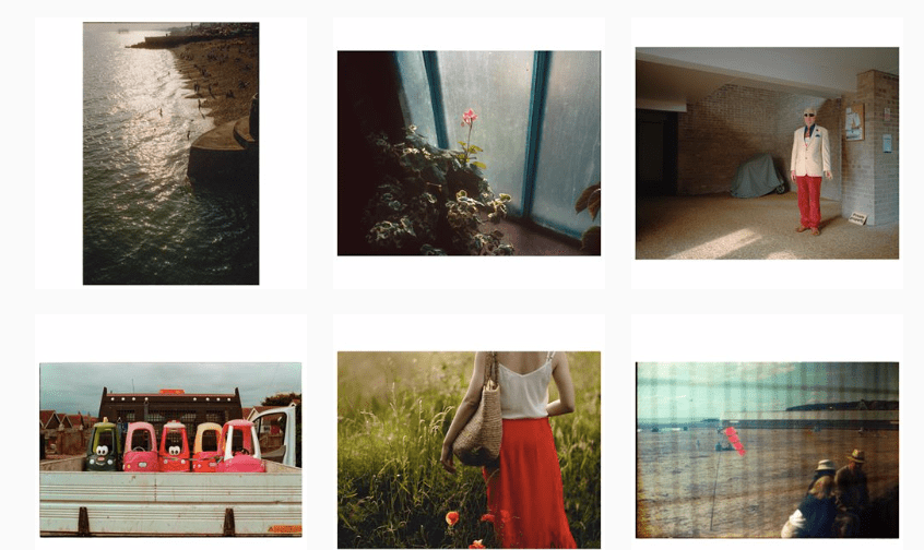
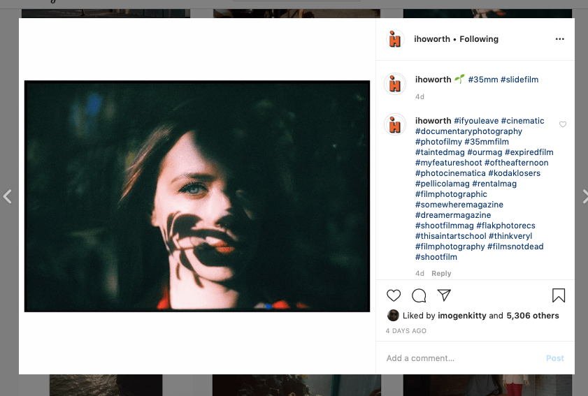
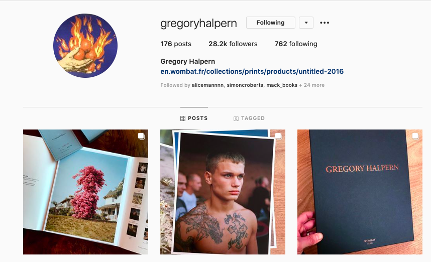
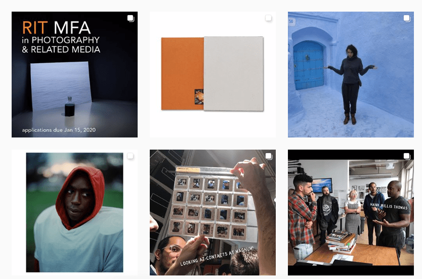
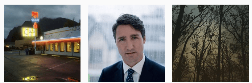
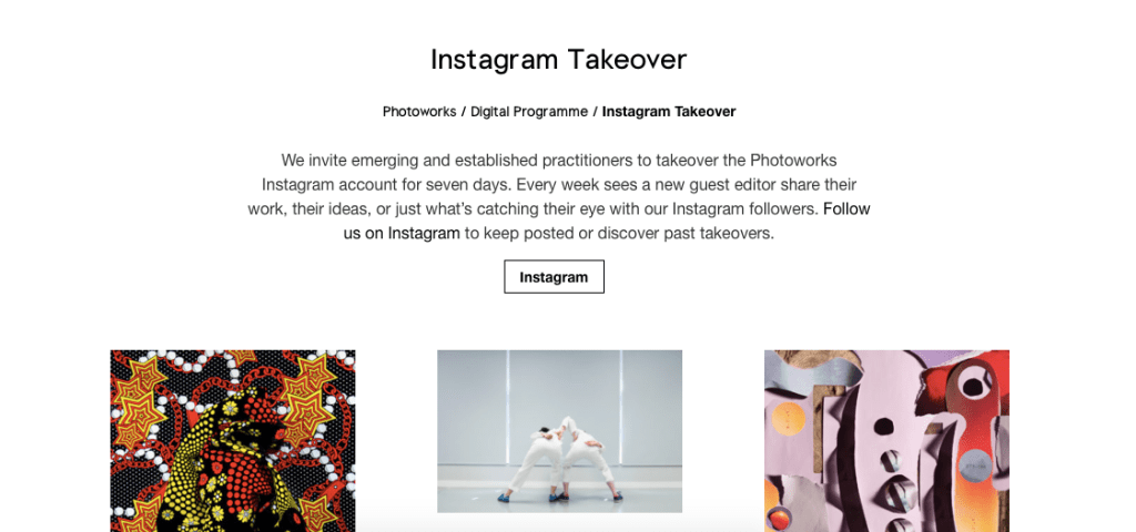
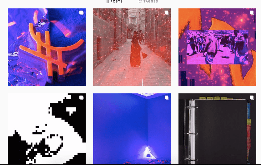
A great example of a brand that does regular photographic Instagram Takeovers is Photoworks, the Brighton Based collective. Each week they aim to promote an artists that they represent by allowing them to take over the instagram and post their work, as well as doing Q & A’s and and speaking about what they produce. They are also able to simply share ideas or someone else the admire, which is very engaging and inspiring for followers. There is also an archive of these available on their website so it feels more permanent. I think it’s a great example of digital collaboration on a platform that can sometimes feel quite narcissistic and self obsessed.

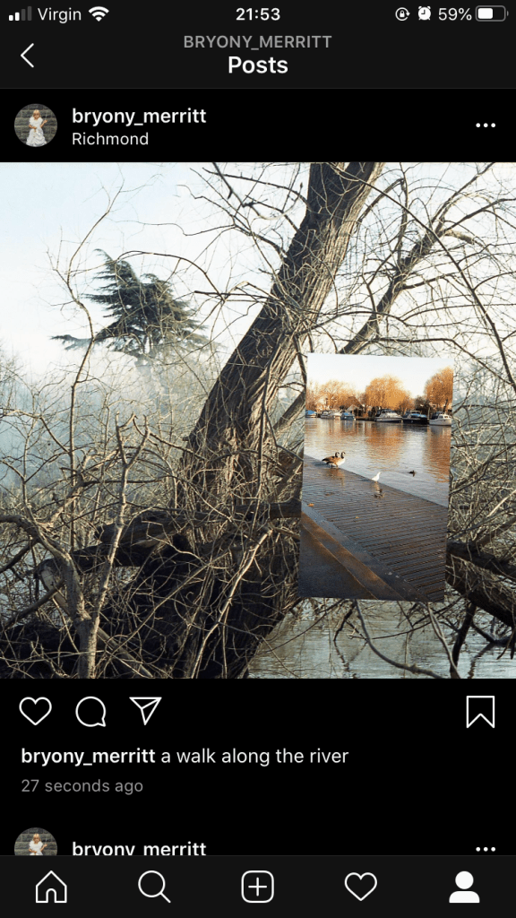
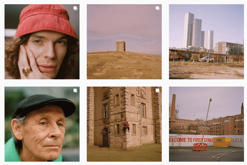
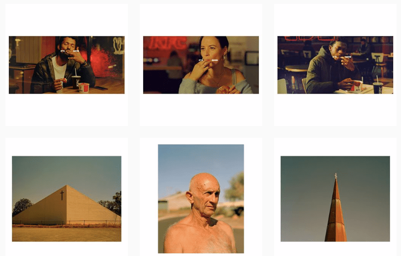
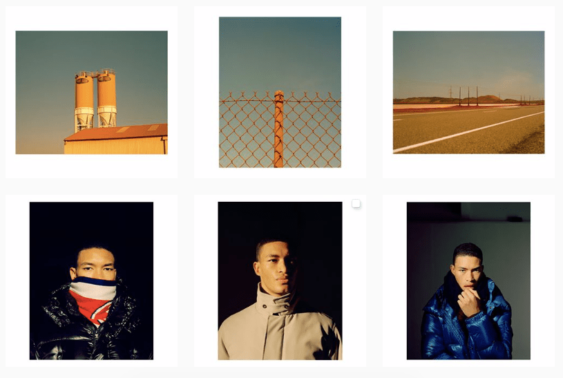
I have my instagram takeover very soon and I feel quite nervous about sharing my work on a larger platform. However, I think it will be good for my confidence to speak to a new audience and it will allow me to practice writing about my work in a simple and effective way as well as being conversational and encouraging feedback. I need to decide on 3/4 projects that I feel reflect my practice as a whole and would be interesting to others.

My Instagram Review: Post 6

I recently got film back from the developers and came across some nature images I had taken during a walk along the river a month or so ago. The walk itself was stemmed from me being inside all day and needed to get out and has informed my interest in continuing with nature as a subject. I was initially only going to post the main background image but I felt it was dull alone and decided to overlay another image on top. It took moments to create but I think it works as a nice piece to illustrate how I felt as I walked that day. The caption is simple but says what it needs to.

For my next post I want to show some images that contrast the nature ones as the colours on my profile are merging together and appearing very similar. I want there to be some variation so my followers don’t get bored.

Mark Power (@marktpower) – Instagram Reflection

  • Bio is concise and informative with link below to his website and shop as he’s currently promoting a book sale.
  • He promotes his books with scans and product shots, informing viewers what the subject matter was . More personal approach to selling photographic work.
  • He uses the multiple tool to illustrate the sheer size of his images, which he tends to split between two slides, then a third containing his full image. Allows followers to zoom and enhance, appreciating the quality of the images.
  • Images are very current, posts as he travels so followers are up to date with where he is and what he’s photographing, a more personal approach.
  • Also eager to answer questions and comments left which again adds to this personal feel.
  • Posts the occasional image of family or football, showing his own character from behind the photographs, important to do this and show a more personal side to followers.

Overall I really enjoy the conversational and informal tone Power uses when speaking to followers. I also think sharing work in progress is important as it illustrates the process it takes to complete a project. I would like to try this throughout my FMP.

Lina Scheynius (@linascheynius) – Instagram Reflection

  • Link to most recent work and book is available in bio, easy access for followers and those interested.
  • Multiple tool used in many posts, specifically with images from her book, allowing followers to take a closer look at what inside.
  • Profile is full of variation: images taken at fashion week and commissioned alongside posts found online that made Scheynius think. Also images of herself with pets and friends.
  • Images containing herself are fun and illustrate her character, allow viewers to feel a more personal connection towards her and her work.
  • Lots of multiple images showing scans of recent work and series that she has completed.
  • Evidence of her work in the gallery space, to encourage people to come and view it and to also illustrate her artistic value.

Overall I like this profile perhaps the best as it combines so many varieties of imagery and interest together. It shows the personality of the artist as well as plenty of her work and creations. I like her sharing of opinions and this is evident in her stories as she usually asks questions or shares what she is up to which is nice to see.

Ian Howorth (@ihoworth) – Instagram Reflection

  • Howorth has clear highlights, which show his features in magazines as well as images from his book.
  • There is also evidence of his Q and A’s which are quite regular, allowing viewers to find out about how he creates his images and help them with theirs.
  • Very active on social media, posts once a day, sometimes a snap on the way somewhere and sometimes an image from his personal archive. This allows viewers to see the development of his work.
  • His style is evident in all the posts but theres a variety of subjects which is nice to see his different interests and focuses.
  • Uses the white borders on his images to frame them and allow spacing between each post, makes it look professional.
  • Uses the hashtags to tell his followers what camera or film he has used, and this again illustrates the variety of his work, as some is film, other digital etc.

Overall I think his highlights are something I should try and replicate as they are informative and useful for those visiting an instagram profile. His use of hashtags is also something I could look at, particularly ones concerning the film and camera being used.

Louis Bever (@louisbever) – Instagram Reflection

  • Enjoy the hand drawn profile image, adds a playfulness and immediately gives us an indication to him as a person. It also feels professional.
  • His website is in the bio so easy to access and view.
  • Bever is very active, posting once every two days and constantly on his story, normally behind the scenes of a shoot which makes viewers feel more connected to his practice. Also uses his story to show his personal life which I think is great as it gives viewers the option to look or ignore, unlike they could if it were a post.
  • All his work fits together and it’s evident its his due to colour palette and subject matter. Differs rarely from portraits or buildings.
  • Uses the multiple tool to post a series of images together so it’s easy for viewers to flick through rather than changing posts.
  • Is very conversational in captions and informal, making the model and reader feel at ease.
  • Bever appreciaties viewers opinions often puts polls and questions on his stories for others to answer and ask.

Overall I appreciate how active Bever is on social media as I find it a struggle to see which post I want to share etc. I also like the viewer involvement and how he encourages people to ask questions and be a part of his work. He also uses his stories for call outs to find people to shoot which is great and inclusive. I enjoy the theme that follows and hope at some point my instagram will appear this way.

Sam Wright (@_sam_wright_photo) – Instagram Reflection

  • Bio is clear and concise, tells us where Sam is based and his website is directly beneath making it easy to access if we wish to see more work.
  • He has a layout which he follows with all his posts, they all have a white mount surrounding them, which looks professional and gives more freedom for resizing. They also all follow the same colour scheme, making it easy to identify that its his work. He also posts in threes, so each row is from the same shoot or series, making it aesthetically pleasing and easy to navigate.
  • He posts commercial and personal work quite regularly, so there’s evidence of the two. Helpful for me to see the changes he makes when shooting something commissioned.
  • He has grouped his highlights very clearly, with regards to features, interviews and mentions. It’s easy to view and understand what he’s currently up to.
  • Wright is also very active with his stories and posting, very present figure. Stories are sometimes more personal than posts but I enjoy this crossover.

Overall I enjoy the layout and care taken into presenting Wright’s work. It feels formal but not all the work is, so it balances out very nicely. The highlights are very informative and useful for viewers, so this is something I would like to try and do.

Gregory Halpern (@gregoryhalpern) – Instagram Reflection

  • Halpern adds many posts about his books, often using the multiple tool so that viewers can see the pages inside. This is a good way or promoting and making followers feel as though they are getting a deeper insight.
  • There is a link to his books in the bio, making it easy to access and purchase them.
  • Advertises for work/jobs on his instagram, making the position open to everyone and less exclusive.
  • Evidence of competitions he has entered as well as encouraging his followers to partake, very involved and inclusive. this is also evident in the posts he does concerning talks and activities that are related to his practice and happening soon. See the image below of him at magnum looking at contact sheets as well as images of him attending another nhotogprhaers talk.
  • I really enjoy that he posts more personal and private images alongside his work. The images of the women stood against the blue tinted building is a birthday post to a close friend but it doesn’t feel out of place.
  • His instagram also illustrates the range of his work, as he posts his more preferred practice and typical images next to more commercial and commissioned pieces.

Overall I enjoy the combination of mixed work, illustrating a professional but also less formal take on the photographic instagram. I also like the use of the multiple image tool so you can present a theme or specific shoot and I have done this in my posts.

Isa Genzken ‘Window’ (2020) at Hauser and Wirth – Press Release Reflection

Upon attending the gallery I was given an A4 sheet stapled containing information on the artwork I was viewing. The press release is simplistic in its layout, and reads like a word document as oppose to something more creative. However, this perhaps works well with the work as it feel very quiet and speaks for itself due to its size. The paper style is slightly off white and less glossy than printer paper, which allows it to differ from a bog standard A4 sheet. The first page begins with a general overview of the piece, introducing themes and interests, so readers have a small background to the work. This then leads onto an artist biography and some of the previous work that’s been created, then finally a few paragraphs discussing each piece in greater depth, alongside imagery. The back page was a CV and more formal biography, as well as contact and information on the gallery itself. This page didn’t interest me greatly but is definitely a good thing to include for potential buyers or others interested in setting up shows. I enjoyed being able to wander round and read, as sometimes when there’s information printed on a wall people gather and its hard to read. However, I did think it was a lot of information to take in at the time, so I ended up scanning the sheet and then taking a closer read when I got home. Going to a gallery and being able to take something away is really great, and makes you feel like a greater part of it as you hold your souvenir.

Although I may not be interested in doing such a plain and formal press release, I enjoy the idea of being able to take something away and mull over this, so this exhibition has illustrated the importance of that to me. This has also helped me decide how I would like to promote my work with regards to business cards, which I would instead be more interested in a postcard format.

Deutsche Borshe Prize 2020 at The Photographers Gallery – Press Release Reflection

The A5 booklets were by the front desk on arrival, and each had a different cover of choice, each depicting one of the artists in the exhibition. There was also the choice to select one with all four artists images squared together. The initial choice in itself is a great way to encourage people in and get them excited, they can make a decision on which they feel is most visually stimulating. The paper choice is similar to newsprint, an off white yellowy colour thats perhaps slightly thicker but light and easy to carry.

Upon closer inspection the brochure is more like a catalog for the events and exhibitions happening in the gallery over the next few months, which is great as people can read about the exhibition they are visiting and then flick through to see if theres relevant events they have an interest in. The front cover is informative, with contents along the bottom so you can navigate easily to what you wish to see. The whole catalog is monochrome, perhaps chosen for printing costs, but I think it lends itself well to the work. Despite the majority of the work being colour imagery, the black and white take makes them all more uniform and the aesthetics work well together, whilst still differing from one another. The first page introduced the prize in a small paragraph and then each artist and their themes and explorative elements. it gives an initial context which is then continued in the actual exhibition space on the walls, which I think is good as there isn’t too much information to take in from the catalog. On each page, as it spans the calendar and events for the coming months, there are also a line of relevant talks and tours which is helpful and saves people having to go to the events page. It’s also good promotion.

Overall I think the size and feel of the catalog adds a value that perhaps the ‘Window’ press release didn’t have. It’s small enough to hold, and fit into your pocket without being bent, unlike the A4 sheet from Hauser and Wirth. The amount of information available also makes viewers more likely to keep it so they can refer back and the choice of cover and large image on the front makes it attractive and something worth keeping. I defiantly prefer the booklet approach to press release/cataloging although I do understand that the more work and information, the more paper needs, hence why Hauser and Wirth perhaps only use a few A4 sheets.

Design a site like this with WordPress.com
Get started