My Instagram Review: Post 5

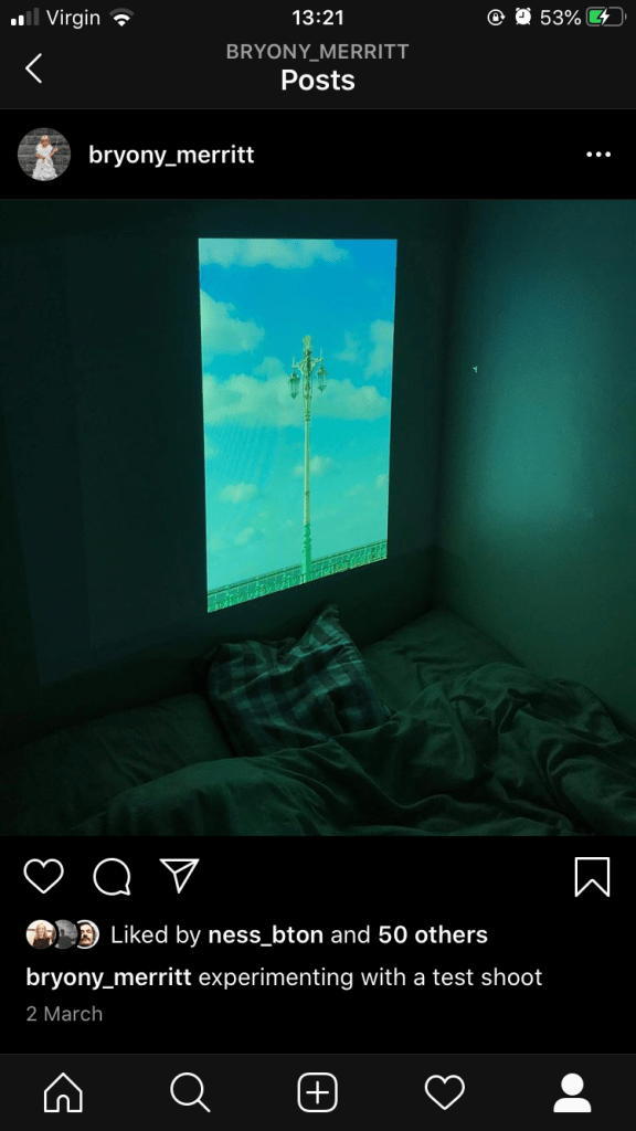
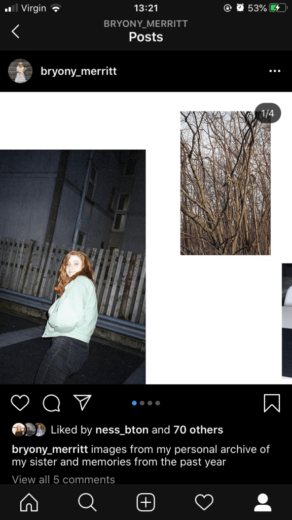
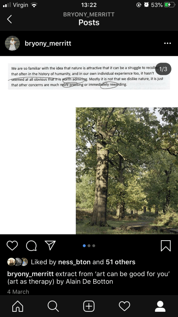
This is one of my favourite posts, which is also the most recent. I have been doing a lot of reading on nature and the effect it can have on us and have always had an interest in text and image combined. Using the same photoshop layout I used a few weeks ago I decided to post my tree images alongside an extract from a recent essay I read. The tree images are so detailed and large that I initially felt they should be posted as normal instagram posts, with no border or text. However, the writing has become a huge part of my work and it felt good to combine the two, and the scrolling option again so people can look through the images on one post.

I also used a scanned part of the essay as the notes show the work in progress and the research I’ve been doing. The instagram is working really well as a visual diary and sketchbook and I’ve received some positive feedback which feels good. I also like the informality of instagram in comparison to my website, which feels like it tends to be more polished and finished work.

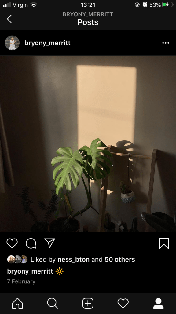
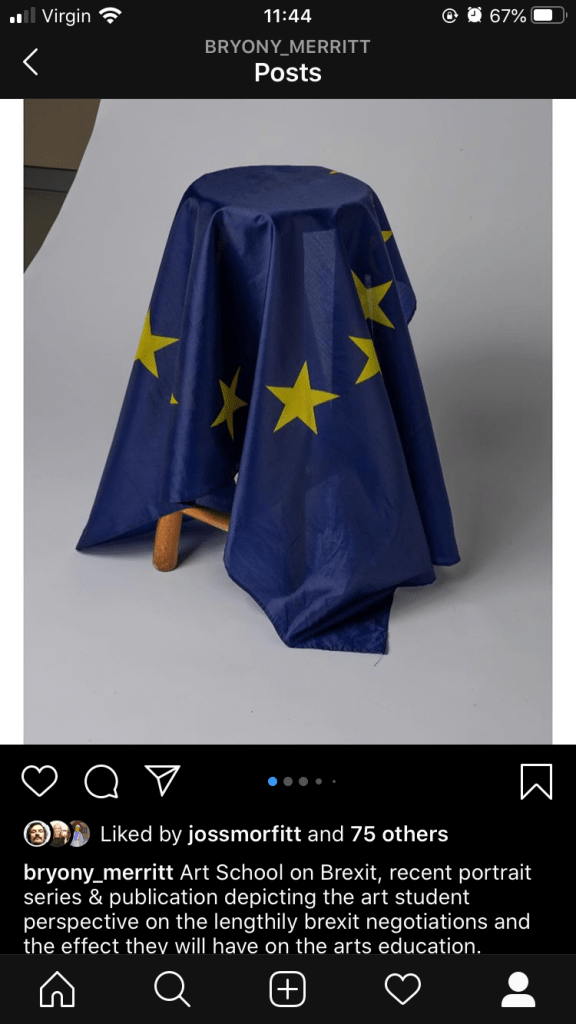
The caption again is very simple but the text on the image is what’s more important to the viewer, I simply wanted to credit it.

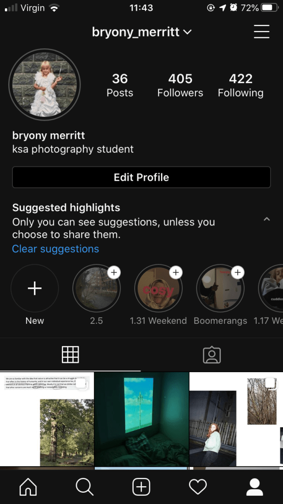
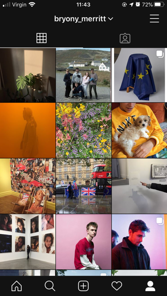
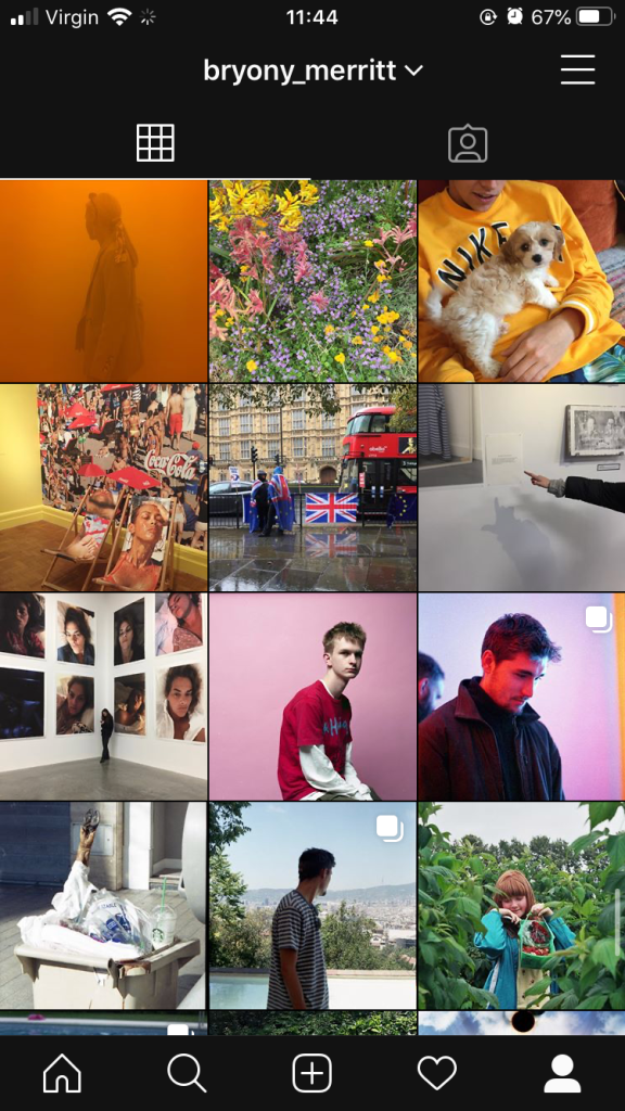
This is what my instagram currently looks like. I could perhaps look at adding a little more information about my practice or me as a photographer in the bio. I would also like to post some highlights, perhaps shows we have put on etc so this is something to work on in the coming months.

My Instagram Review: Post 4

This was my most recent post, which depicts an image I took in Brighton and just looking at different presentation modes. The caption is very brief but I was looking at how to present work and just wanted to see what a projector looked like, especially in the home setting. The image really differs from others I have posted but it felt greta to share something a little different and I feel another image with a white background may have been too similar.

I enjoy showing the work in progress aspects as I feel its key to make clear that work doesn’t come from thin air, and the experimenting is a huge part of my FMP and deciding which direction I want to go in. It again relates to the personal aspects of my life and what goes on behind the scenes which I find important.

Perhaps looking back I would try and add a little more information to the caption, that I was testing out for my final major project but I don’t want to give too much away as I’m not even sure what direction I’m going in yet.

My Instagram Review: Post 3

I posted this after the interim show, which I felt quite disheartened by as I rushed my piece and wasn’t keen on the layout. I decided to re-look at the images I had presented and change their layout, by making it part of a scrolling post on instagram, which felt more reflective of my sketchbook and the images being a work in progress. I created a document on Photoshop, comprised of 3 squared and lay my images across them, some overlapping so viewers would be encouraged to scroll along to view them all. I really enjoyed creating this post and it fits really well into my theme and current instagram layout.

The caption again felt hard to write so I decided to simplify it to what it is, archival images and memories. Instead of placing a meaning behind it I wanted viewers to take it at face value and simply enjoy what they saw before them.

This layout is defiantly something I will approach again as I enjoy the negative space and less formal feel to the images.

My Instagram Review: Post 2

My second post comprised of the image above, taken in my room during golden hour. The image feels typical of an instagram feed which I don’t mind as it feels more casual and reminds my followers that I am also posting things I enjoy as well as my own work. My work is so concerned with nature and natural light anyhow so the image felt relevant and when viewing the instagram as a whole it fits well with the colours and aesthetics of the other posts. Perhaps the caption could have been more informative but I was simply documenting something i found beautiful and aesthetically pleasing, its an image that perhaps could crop up in my workbook.

I also didn’t want to caption it with a meaning and story when it didn’t have one. I think in the art world we are sometimes too concerned with applying a concept to a piece, when in fact the image was taken simply because I wanted to or because it looked nice. Nigel Shafran explained this when he came and did a talk, his Washing Up series is questioned for deeper meanings when he claims it was something he wanted and did do. It nice to admire an image for what it is.

This is what my instagram currently looks like and I think it really represents my practice and the wide range of interests I have as well as illustrating what I get up to and the work I produce. There is evidence of gallery visits, alongside personal portraits and simply enjoyable aesthetics.

My Instagram Review: Post 1

This was the first post I decided to add as part of the new module. It felt nerve-racking to share something I had created with followers that perhaps weren’t expecting it but i felt this was a good thing to share as it wasn’t so personal to me as other work. I also posted it on the day we left the European Union so it feels poignant and a piece of history. I hoped my followers would feel the same and perhaps find some comfort in the imagery. I posted the portraits from the project alongside this as well as some images of the publication I created, which can be accessed by scrolling along on the post.

I found the caption the trickiest part, as it felt unnatural to write in such a formal way so I attempted to find an in-between, so that its informative but conversational, not pretentious. I got some positive feedback from friends and colleagues on the images and topic, which made me feel far more relaxed about posting next time.

My Instagram Review

The feedback I got at the end of the last module was cornering the lack of posts and imagery that I was posting on my photography instagram. I didn’t have much of the presence and the images were simply uploaded in a rush for the deadline, there wasn’t a real order or meaning behind them, I used it as more of a visual diary. It felt unnatural to have to post so regularly and I really struggle with creating work I think is valid and like enough to share so this made it even harder. I decided to take a look at my personal instagram and see why I enjoyed posting so much more on there than my professional profile.

My personal instagram contained photos of friends, family, holidays and exhibitions I had visited, but they all held aesthetics in common, with many of the images taken on film or with natural light, which is a main part of my photographic practice. I began thinking more and more and decided to begin posting my work on my personal account, and combine it so that followers have the chance to view my work as well as seeing carefully curated and selected images of my personal life, as this is something that fuels what I create anyway. I archived many of the images that didn’t feel artistic or photographic enough, and then decided to start posting my artwork.

I also chose to change my occupation to visual artist and write this in my bio, so when people clicked on my account this is the first thing they become aware of. It feels good to be excited to post as oppose to dreading it, and I do understand why most people would have separate accounts but my work is so concerned with my own life that it feels they should be connected and on view to others.

Website Review: Marina Abramovic Institute

Positive Aspects:

  • Logo is simplistic and clear, stays in the corner throughout the website and is also a home button
  • Homepage begins with slideshow of imagery (as shown above) of a few of the many works Abramovic has created, old and new. Evidence of workshops as well as more personal work, shows a journey through the art world
  • Scroll down directly from the slideshow and there are dates and links to events currently happening to be a part of.
  • Well organised with regards to projects and navigation, there is even a search bar to look through her archives
  • Contact page is simple and clear

Negative Aspects:

  • The drop down menu isn’t always clear or visible depending on what image is on the slideshow
  • The scroll down sometimes veers to the left or right, meaning some of the words become unreadable or off the screen

Overall I think the website is clear and successful in informing people of Marina’s work and the current events they can get involved in. It’s different to the previous websites I’ve explored as this is more of an institute, so its perhaps more formal and looks more at encouraging people to get involved as oppose to simply sharing work. However, I really enjoy the initial slideshow so viewers can take in what kind of work is being produced, and I think the logo is great to have as a homepage and is so clear. I want my website to be slightly less formal, as I’ve discussed but this has been a great layout to see how larger names in the art world choose to present their work and practice.

Website Review: Olimpia Piccolo

https://www.olimpiapiccolo.com

Positive Aspects:

  • I enjoy the front homepage, feels bright and automatically gives a sense of personality. The font is also very clear and a good choice
  • Project pages are all very different from one another, can decipher each one. They begin with a coloured background with a bold title then scroll for imagery. The images are placed sporadically on the page, making for more of a sketchbook feel, which I personally really enjoy, it feels far less formal and differed from many other websites.

Negative:

  • The homepage would be good if you could click to enter the site, as it feels pointless to have the page there after you have visited once, there’s no options or buttons on the page, only on the drop down menu.
  • The bee that flies in and rests on the font feels strange and out of place, I was unsure how this connected to the work and why it was there
  • The home page is also only fully visible if you scroll down, otherwise the artists name is not clear, would be good if this was centred.
  • The about page is very dull and corporate in comparison to the bright colours that are visible in the rest o the website.
  • I like the three lines that are a button for the drop down menu as they are not distracting but the drop down menu being central is not something I’m too keen on.

Overall this is a website I really enjoyed scrolling through and I have taken some inspiration from. I love the personality that shines through, evident in the colour and font choices. The placement of imagery in a less formal way is something I would like to replicate with my work. I think it just needs to be evident throughout the website as the menu and about page lack this and feel disconnected in comparison.

Anita Corbin ‘100 First Women Portraits’ (2020) – Exhibition Reflection

Brighton Museum is a small museum based in the centre of town and known for its artefacts and general historical exhibitions. I was excited to see they were putting a photographic exhibition on, especially with the focus on women by a woman. Anita Corbin decided to photograph women who had become the first to do something, whether it be an occupation, an award etc. The collection of firsts varied greatly and the curation and mix of images illustrated the equal view that Corbin took on these roles and achievements, that they all mattered and deserved recognition. The choice to place the first women to be a surrogate mother next to, say, the first woman to be a speaker in the house of commons, tells of a necessity for both jobs and a celebration of all that women do. It’s an important exhibition that I think everyone needs to see to understand the leaps and bounds that we have made over the past few decades trying to catch up with our counterparts.

The images were split between three rooms, in order to accommodate all 100. They were placed side by side at an equal level on all walls, except for the last room where some images were placed in a less formal order at varying heights, which I think was done for space. I think the size of the prints were perfect and as you can see above, when the light came through from the roof, the room was lit in such a natural and beautiful way, it almost emphasised the quality of the women and their persistent strength.

I think this choice of presentation, having them all evenly placed, works well for this exhibition but for myself I would choose something less formal. I would perhaps like to place images above and below, to overwhelm viewers of the sheer amount of women and their achievements and to illustrate that we are here. I think the choice of black frame does fit well with all the images though as they all have darker coloured elements, more so than brighter. From the exhibition I have decided that larger prints in my style of work are better for an exhibition space, they allow viewers to see more in the images and make an impact on the space.

Deutsche Börse Photography Prize (2020) The Photographers Gallery- Exhibition Reflection

I recently visited the Deutsche Borse prize which is highly anticipated every year in the photographic world and brings together a huge range of work to one space. I’m going to be discussing one piece from the exhibition as it felt so unusual and sparking an interest in me with regards to presentation.

Anton Kusters, a Belgian photographer presented his piece One Thousand and Seventy-eight Blue Skies (2019) consisting of 1078 polaroids laid down on a large square table for viewers to rotate around and explore. On the table lay polaroid images, all with the same blue hues yet differing form one another. From a simple aesthetics perspective it’s pleasant and attractive and its layout is unusual so attracts attention. It’s only when reading the statement that the context of war and the seriousness of the work comes into play. The images are taken where concentration camps were during the second world war, all with the camera pointed towards the sky. Beneath each image is the co ordinates and the number of people held in each camp, illuminating gate sheer destructive power the war had on these people. Yet what I find so strong about the work is the sense of hope and choice of subject matter. Instead of focusing on the remains of these buildings or what has been built on top of them, Kusters’ has instead chosen to photograph something that was there when these people were trapped, and is still there to this day. He has managed a kind of photographic time travel, by documenting what they could see.

The camera choice reflects this idea of only capturing a moment once, being unable to edit and moving on. These people would only be outside for certain times in the day, they would perhaps get to glance at the sky then be hustled along. I think its a beautiful tribute to those lost in the war and what we can take from it.

With regards to presentation I feel that laying the images down instead of hanging them alludes cleverly to a grave, as we peer down to pay respect. I also think it allows viewers to read all of the numbers as they circle the display, and take it all in. The sheer amount of imagery also adds an overwhelming sense of sadness and necessity for respect. This choice of presentation changes the piece completely and removes it from a traditional photographic piece to something more concerned with fine art and history. I hadn’t considered that work doesn’t always have to be hung so this really spurred my thinking forwards and has made me consider moving images from a wall to a floor or plinth.

Design a site like this with WordPress.com
Get started