After my previous hand in I was told to make some changes to my website to make it more viewer friendly and simplistic. The website was a work in progress anyway so I was happy to make some changes and try to create a website that best reflects my practice and personality as well as being aesthetically pleasing.
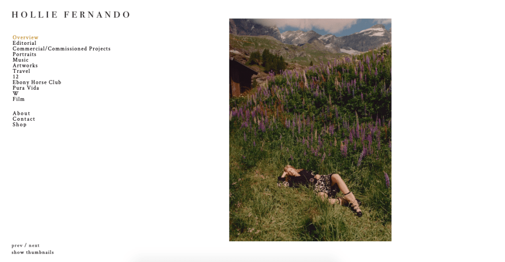
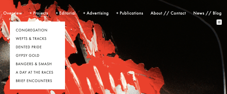
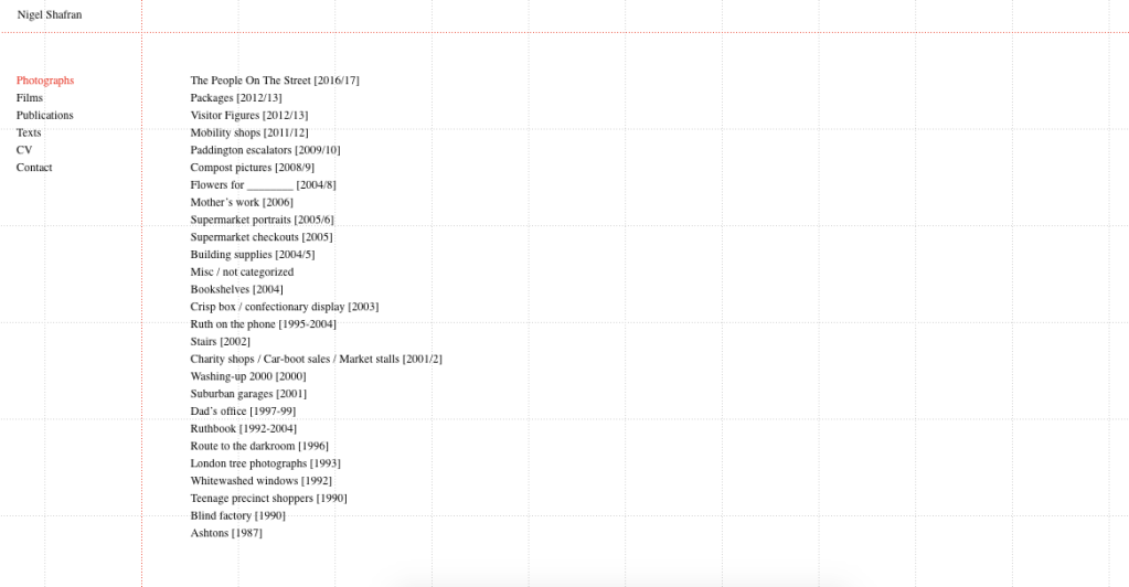
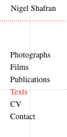
These are screenshots of my website at the moment, which hasn’t been changed since deadline in December. I chose to use Cargo as I felt there was more freedom with the layout and what I wanted to do. I wanted to create branding for myself, hence why I made a gif of my name moving in a heart shape. I did this as I have seen so many websites with very corporate looking names and I wanted mine to reflect the more personal and fun approach I take towards my work. I was told this moving heart was distracting to viewers so I’m hoping to try and use my name handwritten instead as I feel this will still illustrate the personal aspect but will also be more simple.
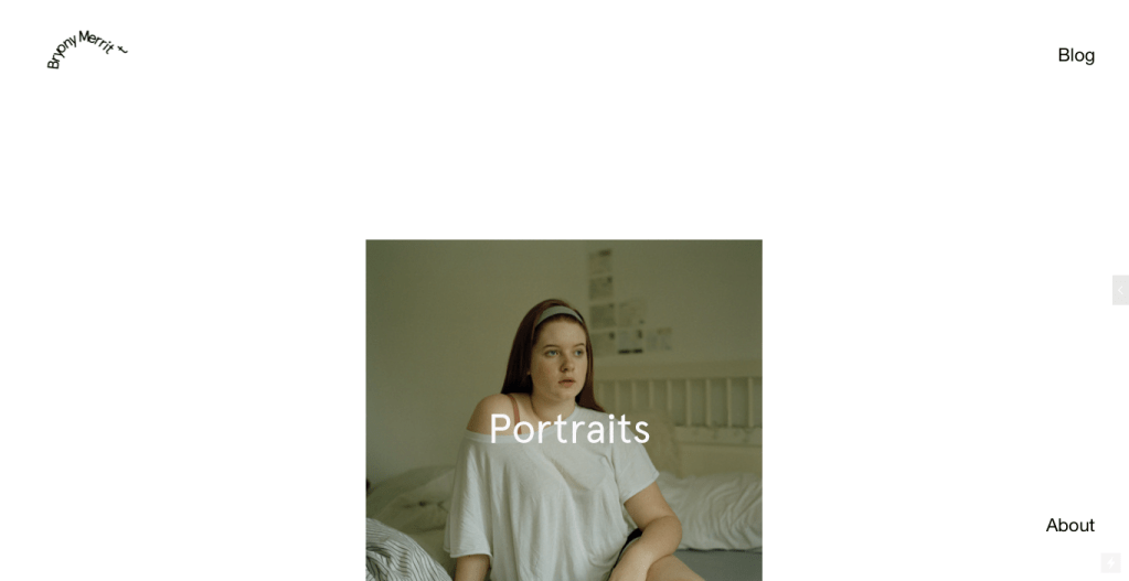
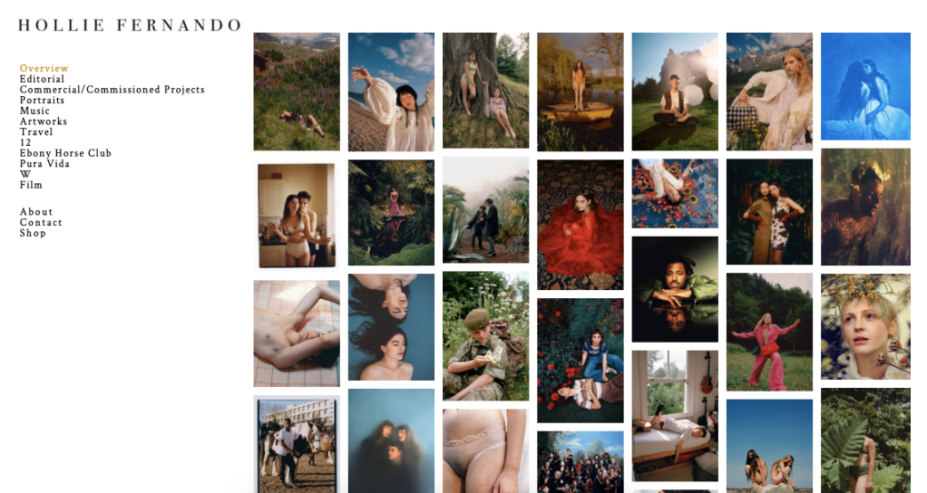
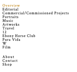
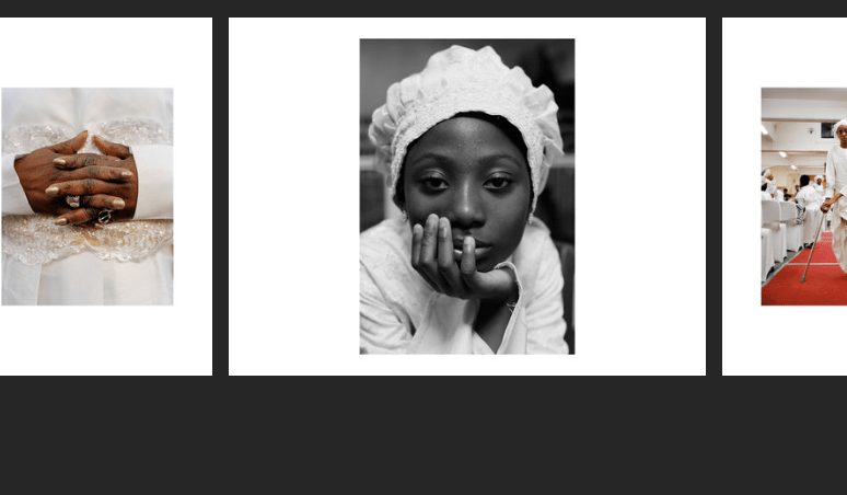
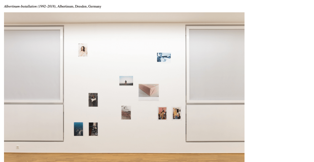
I was also told to remove the blog which I will do, it was simply placed on the website so it was easier to access for tutors when marking my work. I do enjoy the projects scrolling through so people have the chance to see a little debut of each project. I’m unsure whether I will keep the text on top as some of the names I’m unsure of. I also may change the background colour as I’d prefer more of a pattern or very subtle colour. I also want to add a sidebar which has access to all the projects and perhaps move the ‘about’ tab there as well.
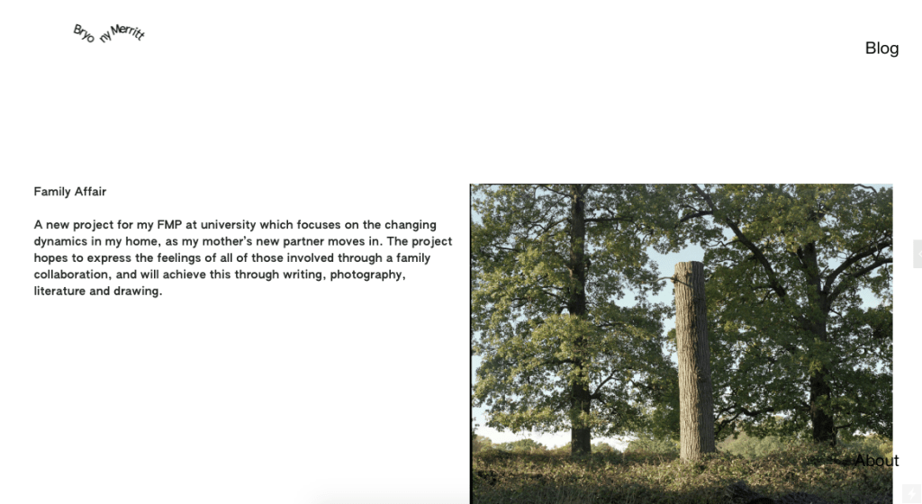
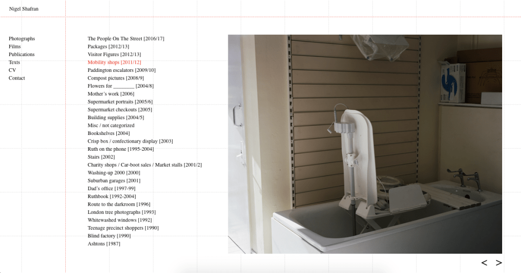
I also need to be careful in my wording as I’ve written ‘FMP’ which is not very clear to anyone not at the university. With my project pages I would also like the images to be a little bigger and be more central to the page. It would be nice if they could be placed in a less formal way so I will look at doing this.
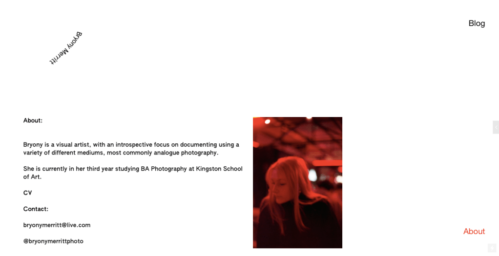
Finally I would like to find a different image to use for my ‘about’ page as I feel this isn’t a great representation of me as a person. I will get a new image taken soon. When I have written my CHS statement this will also be added so that people have a little more information about my practice. My CV could also do with some refining and the layout should be changed so it’s a little more simple for people to read.