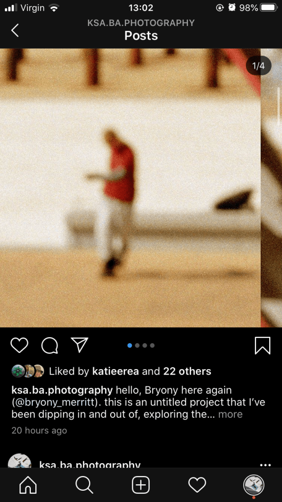
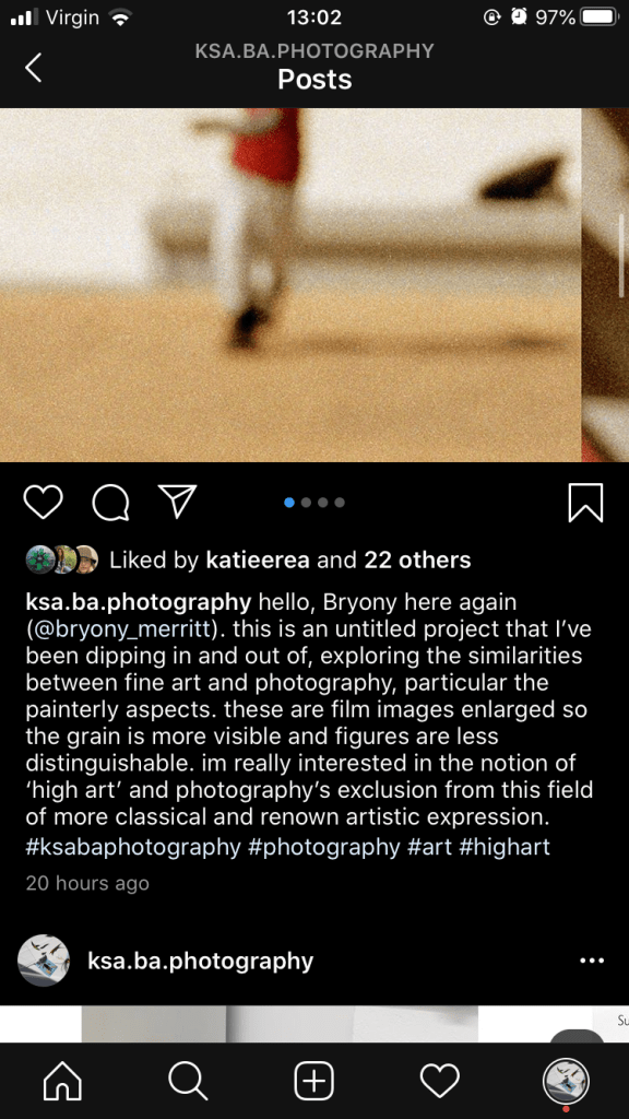
This was my second post. This is work I haven’t previously shared anywhere so I felt quite self conscious but thought it was an interesting concept and something worth sharing. Again I combined the images on one page so as you scroll they overlap, feeding into this blur and graininess. I felt each time I uploaded I was gaining more confidence in my work too. I also promoted the posts on my instagram, so people unaware of the BA Photography page were going to have a look at the work.
This was my first post in the takeover which I used to gently introduce myself and give a little context to my practice. It felt really naturally speaking that way and professional. I was worried about sharing work but it felt good to share with a new audience.
I shared a finished project as its a clear way for viewers to see my work as a whole. I decided to take the images out in a more sparse way as this is the way I present work on a wall so it felt true to myself. With the hashtags I was unsure what would be fully relatable so opted for just a few as I don’t tend to do them. It’s something I will consider for my own instagram as I know its a good way to gain followers and share work to a wider platform.
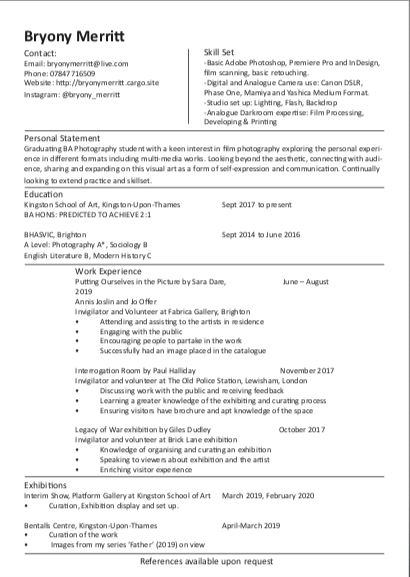
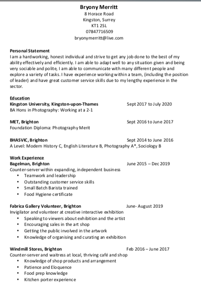
This is my edited CV. I would have preferred to use a different font and perhaps not such a simplistic layout but I was told it needs to be clear and easy to read which I feel it is. It was hard to think about the skills I had gained over the years and which would be relevant, as well as speaking about the jobs I partook in on work experience. Overall the activity made me feel happy with the work I have done and the skills I possess and has made me want to continue gaining his. I placed the lines on the document to make it the division between each section clearer which I think is successful.
I think my CV is representative of a traditional and creative layout, as it’s not listed the same way as a creative CV would be, with many having long lists of experience and exhibition. Yet unlike a traditional, there is evidence of my skillset and my experience has all been tailored for the creative field.
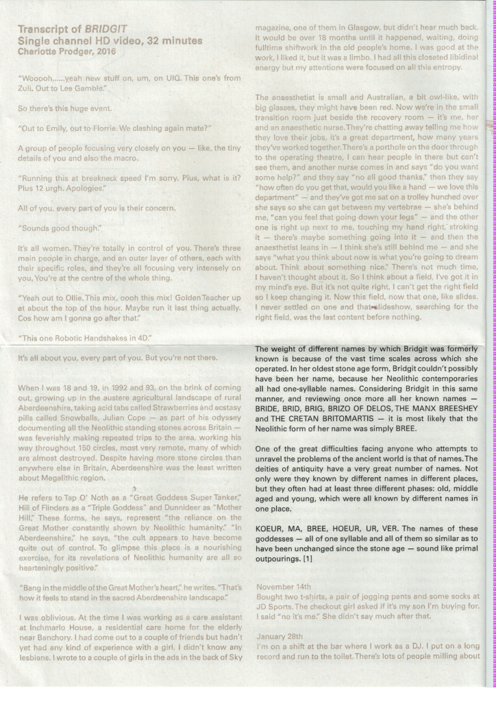
This is the press release from Prodger’s winning submission to the Turner Prize which was a video shot on iPhone, exploring themes of nature and identity. The press release was stationed just outside the dark screening room, so it was essential it was read before entering in order to gain some context. It was printed on what felt like newsprint, so very thin and already had an informative feel about it, with its correlation to newspapers. It folds out to an A3 size, with information on every side, the front with its cover and context, whilst the back is a transcript of the film itself. This works well within the space as viewers can read the brief description, then refer back to the transcript after viewing the piece.
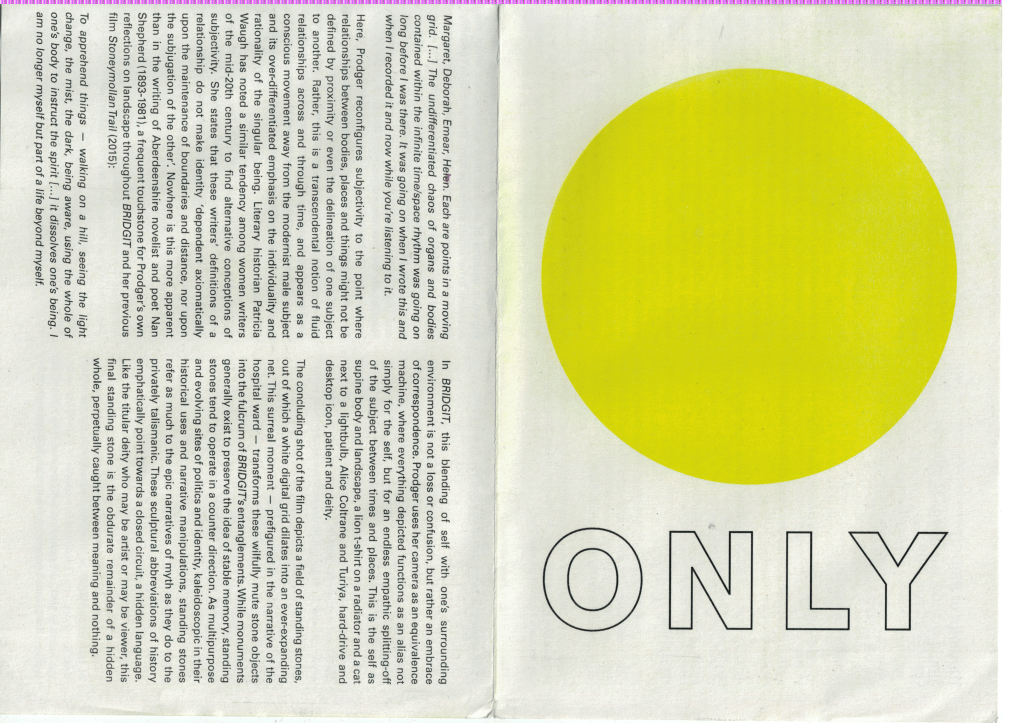
The colourful cover is intriguing, with only an ambitious title and the bright yellow circle. It invites the viewer to continue looking through and question what the title and image refer to. If you turn to the reverse side of the catalog, the transcript has been printed in two different inks, the viewer has to tilt the page to read the bronze writing. I think it has been printed on the Risograph, inferring an appreciation of traditional print techniques from the artist, which I love and think is a wonderful way to bring a sense of history into the contemporary.
Overall I really enjoy this simple catalog and the choice of folding, rather than stapling. Viewers are then able to stick the piece up as a poster. The printing method also adds a value and care unlike other pieces, as the risograph is time consuming and hard to access. I think the choice to include the transcript is also useful as a reference back to the piece and makes it worth keeping.
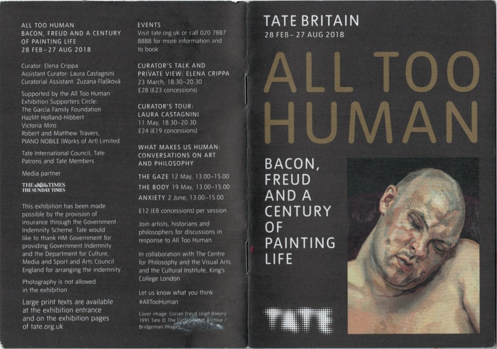
As always with the Tate, they follow a similar style with all their press releases and catalogs, evident in this example. I enjoy the A5 booklet style, it’s simple and a good size for people to place in their pockets and take away. The black paper choice also differs from simplistic white printer paper, making it stand out and again adding to the value of it as an item to take away. The texture is also thick and gives a textured feel to the images, which is unusual and different.
The wording is the same as within the exhibition, allowing those visiting to easily flick through to the numbered room they are in and read from the booklet, as oppose to the wall. I think this is a more accessible way of providing information as it allows people to move at their own pace through the artwork.
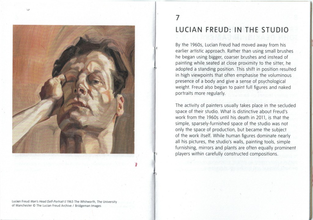
It’s well written and provides information about the piece in before you as well as contextualising it into the exhibition theme. I am still referring back to this guide for information on Freud’s practice instead of looking online, illustrating how useful it is.
The back of the catalog provides events and dates about the show, giving people something to explore further, should they want to. This is a useful tool to bring people back to the space and to get them talking.
Overall, I really enjoy this as a catalog for an exhibition as it feels like something more valuable and worth taking home. The choice of paper colour and type adds to this value and makes it stand out. Inside its very clearly ordered and written, pricing valuable context and info on the artists as well as time to think and assess for ones self.
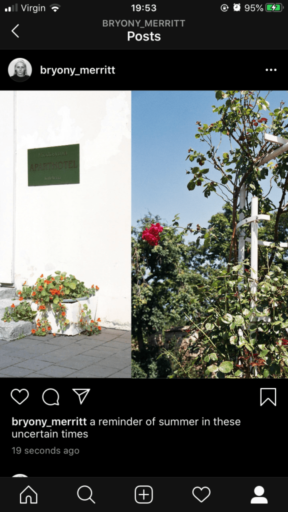
I decided I wanted to upload some old images that fill me and hopefully followers with some ease. The fear of the corona virus is visible as every other post as I scroll down instagram and it’s really affecting my mental health, as I’m sure it is many others. Whilst our jobs, homes and lives aren’t feeling stable at the moment, nature continues to thrive and move and this is what I wanted to show. Some simple beauty in what surrounds us. When I do my takeover I’m going to go into further depth about the effect nature has on our wellbeing and how that links to my project and is relevant now. I am really enjoying not necessarily posting projects but simply images that I have taken and want to share. It has allowed me time to stop and look through my archive and admire images I hadn’t thought much about previously. The caption is again very simple but my followers consist of colleagues, friends, family and those following for my work so I don’t feel the need to be formal.
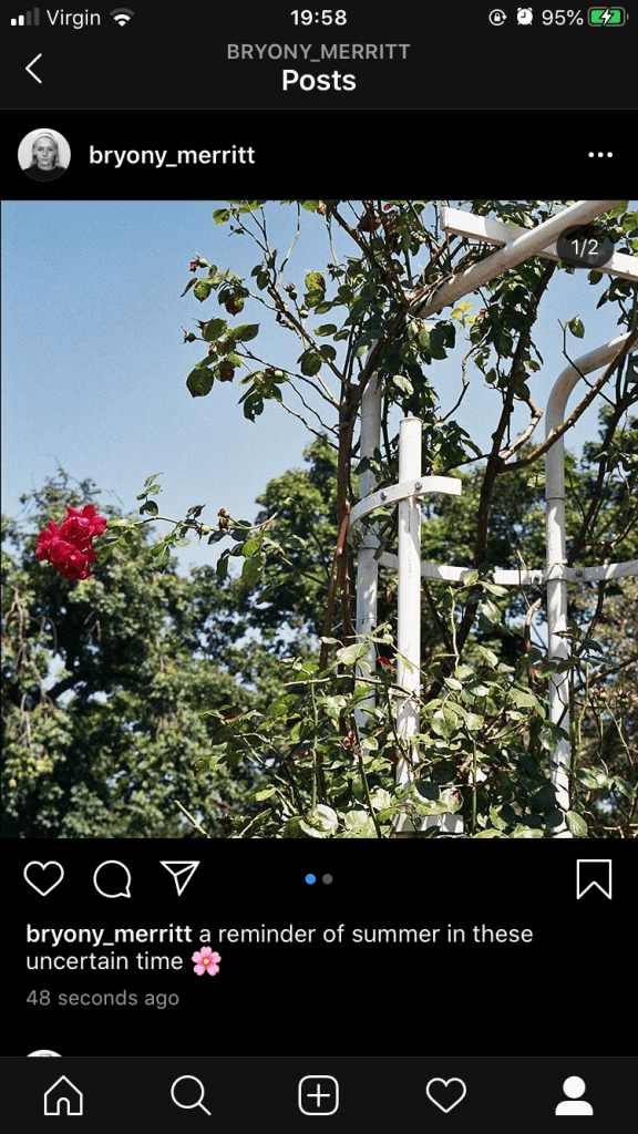
Before posting this version I did initially post this edition of the image, but my instagram has a lot of white in it and I wanted to mix this up, hence why I enlarged the rose image.
It feels good to be posting with all this time spent inside and nice to communicate with others. I hope my images serve as some kind of break for those others who are craving normal life once more.
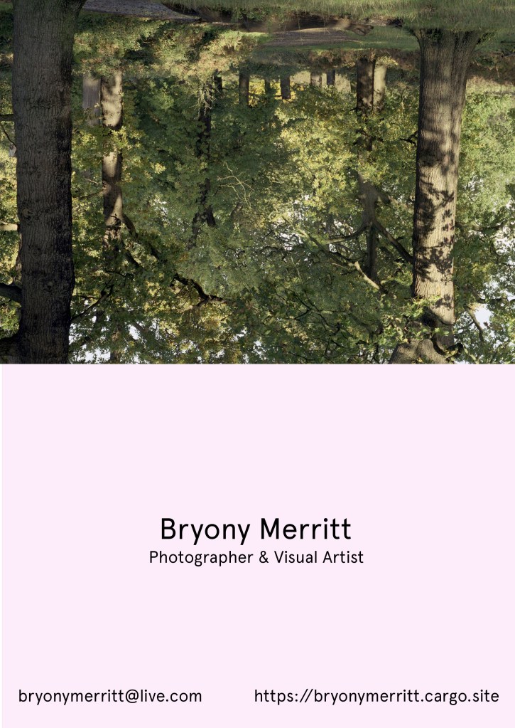
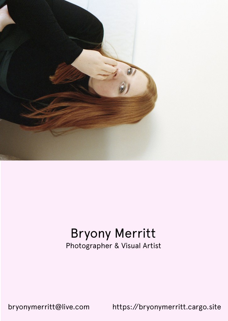
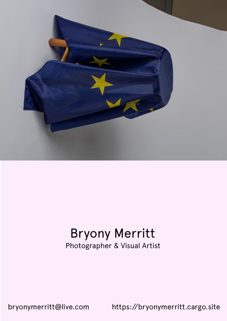
I’ve been looking at creating a business card/ Postcard that can be placed alongside my work if its ever up somewhere. I think a postcard would suit my practice far more as it gives viewers something to take away and put up as well as being bigger and showing my work more clearly. These are just a few mock ups but I know I want to change the font and positioning of the text. I may end up having several images on one postcard but it is also nice to give the space to one image that represents a project I admire. I’ve shown them this way so it illustrates the front and the back.
I have attached the press release above as an edited pdf. I have highlighted aspects I think are informative and useful. As the press release is online, its quite plain and simple, an A4 sheet as oppose to a booklet or different paper type. When thinking about this even if I were to release something online I would perhaps add some colour or make it a downloadable poster. I do also understand that press releases have to be clear and have versions with bigger fonts etc for those with impaired vision so the simplicity is probably due to this.
I think its very informative, with the general dates and private view dates all visible and the first thing we read about. It then moves along through each piece of work, expressing the interest and where this came from and then despairing the word to an audience and giving them context. It enriches the work they are seeing before them and helps the understanding. This then led into the next paragraph about the second selection of work that avaliable to view, which is related to this work and stems from her interest in family and more specifically children before the camera. It was well written and easy to understand.
There was then some information on Dijsktra’s practice in general, almost like a mini CV with other places she has displayed work and awards and books that she is connected to.
I think it was a informative and well written press release, which gave me just enough detail that I could wander round with knowledge on the subject but still make up my own opinion and think deeply about the work.
The layout of a creative CV feels very different to the traditional CV, with regards to a personal statement and education and grades. I am going to look at features of these four creatives CV’s in comparison to my CV I use to apply for part time jobs.
He begins with a short line with his birthday and then his location so people know where to contact him and where he is based.
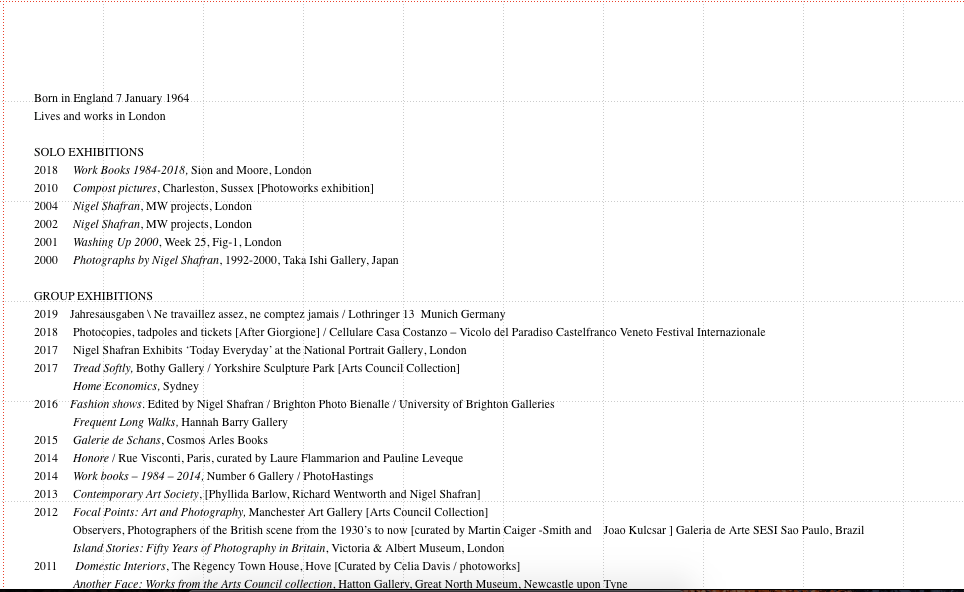
Shafran’s CV is comprised of several small lists, written in chronological order and categorising ‘Solo Exhibitions’, ‘Group Exhibitions’, ‘Awards and commissions’, ‘Publications’ and books he’s has been featured in. They are all dated, with the name and then destination or publisher.
Unlike a traditional CV, it seems to be less concerned with education and grading, and more so with experience and places you have exhibited. There is also no personal statement, so the sheer amount of experience in galleries and displaying is meant to make up for this. I quite enjoy the lack of statement as on a website this would probably belong on the about page as oppose to the CV.
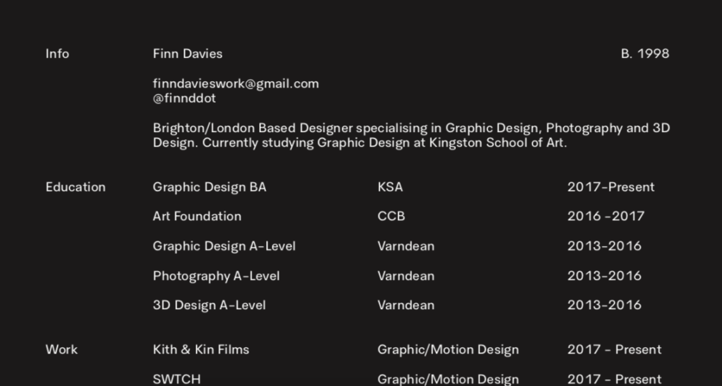
Unlike Shafran’s, Davies was a separate document then placed onto his website, which is perhaps more useful for printing and sending to clients.
Categorised into ‘Info, ‘Education’, ‘Work’ and Skills’
Begins with birthdate, I am not sure if this is entirely necessary as it could lead people to be bias but many seem to add it.
There is then a brief statement on his practice, explaining his work as a designer and his other interests. Summarises what he can do in a clear and concise way, far shorter than a traditional CV.
There is also contact info which I have on a non creative CV eg email and number.
He has listed his skills and his number of years experience, which I hadn’t previously seen. Very useful for potential clients as they have an idea of the work you would be capable of completing.
In comparison to my traditional CV it feels similar in its layout with education and contact details listed. However the inclusion of skills was a new addition that i can see being important in a creative CV.
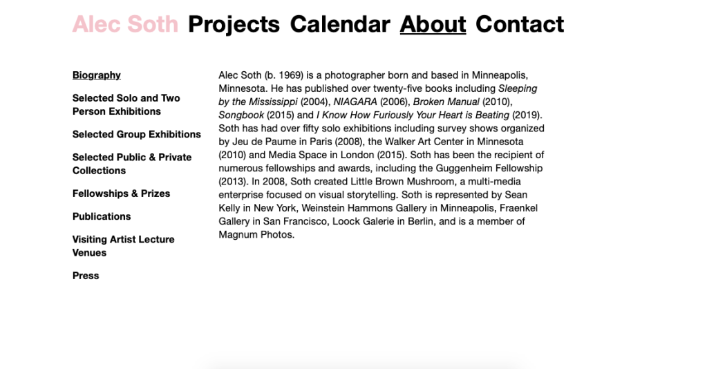
Main page is a biography, with a statement illustrating his main shows and books that have been published, a mini summary of the whole CV it seems. This seems useful.
Unlike the other CV’s, Soth’s requires several different pages, he has chosen to do it as weblinks instead of a list.
The categories seem to be the same for photographers, organised by shows, press and publication. This is not something done on a traditional CV, there would simply be experience, not listed where work had been displayed.
It’s easy to navigate and is organised, doesn’t feel like a CV in a sense as it’s not a list.
Soth provides us with a summary of the CV, which is very different to a personal statement that people tend to write at the top of their traditional cv’s. There is also no mention of education or grading, which seems to be quite a big part of the other CVs.
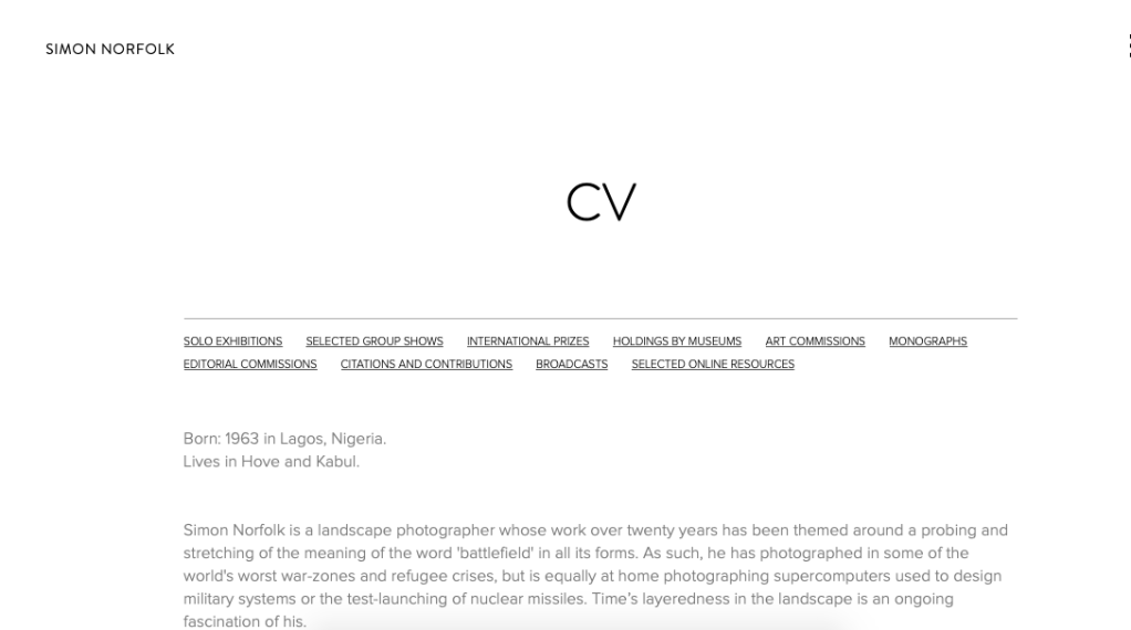
Similarly to Soth, Norfolk has different links to bring you down the page to each category. He has chronological lists of his exhibitions as well as commissions and prizes. Easy to navigate and lots of information and experience. It appears the more there is on the list, the more impressive it looks with these CV’s.
He has listed his birthday and where is he is based, which I would usually do on my normal CV, I would just leave contact information.
He starts with a statement which summarises his practice and interests and then goes on to summarise his biggest shows and awards.
This seemed more personal and the statement was a similar length to how it may be on a traditional CV. However there wasn’t evidence of education or grades, and the experience was the work he had made, not his time working for others.
This is my CV above which I use to apply for part time jobs not necessarily concerned with the creative industry. Like the others it has a small statement but its quite general and doesn’t apply to any jobs specifically. The statement in a creative CV feels more like an opportunity to express your practice and for someone to give you because of it, not due to punctuality and more general skills.
There is also a big focus on education and grades, which was absent from all the other CV’s I looked at. They were far more focused on shows and books that had featured their work and skills. There doesn’t seem to be a need for explaining the roles that were underdone in each job role, simply a name, date and location.
This is my most recent post. I wasn’t sure about using the white border but the image wasn’t the correct square size and it didn’t look greta when stretched. I’m going to try and do alternate border/non border so my instagram has an order but also isn’t too formal.
This is one of my strongest portraits that I’ve recently taken and I felt that i needed to share my work of people alongside the nature images as that’s what my FMP concerns. I kept the caption very simple but to the point, and I hope to expand on this as I continue posting and doing my takeover. For my next post I am going to show some new nature images I have taken and it feels relevant to share them now when we are in such a time of uncertainty and nature is the one place we can visit without fear of illness. I am enjoying posting but find it hard to find which images I think people will want to see.